Ntag
An identity connecting community, creativity and the natural environment for Nomadic Tech and Art Garden.
- Client
- Ntag
- Sector
- Arts & culture, Technology, Creative community
- Our work
- Visual Identity, Logo Design, Graphic System, Brand Applications
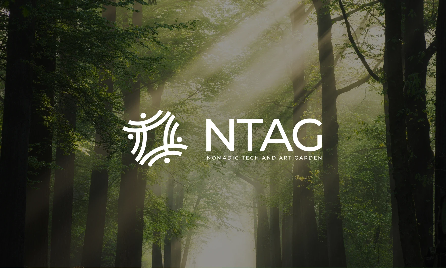
A place for art, technology and shared experience
The brief describes an eco-friendly art and technology garden with an atmosphere of freedom and creativity. It welcomes artists and non-artists to display and appreciate art across different forms and media.
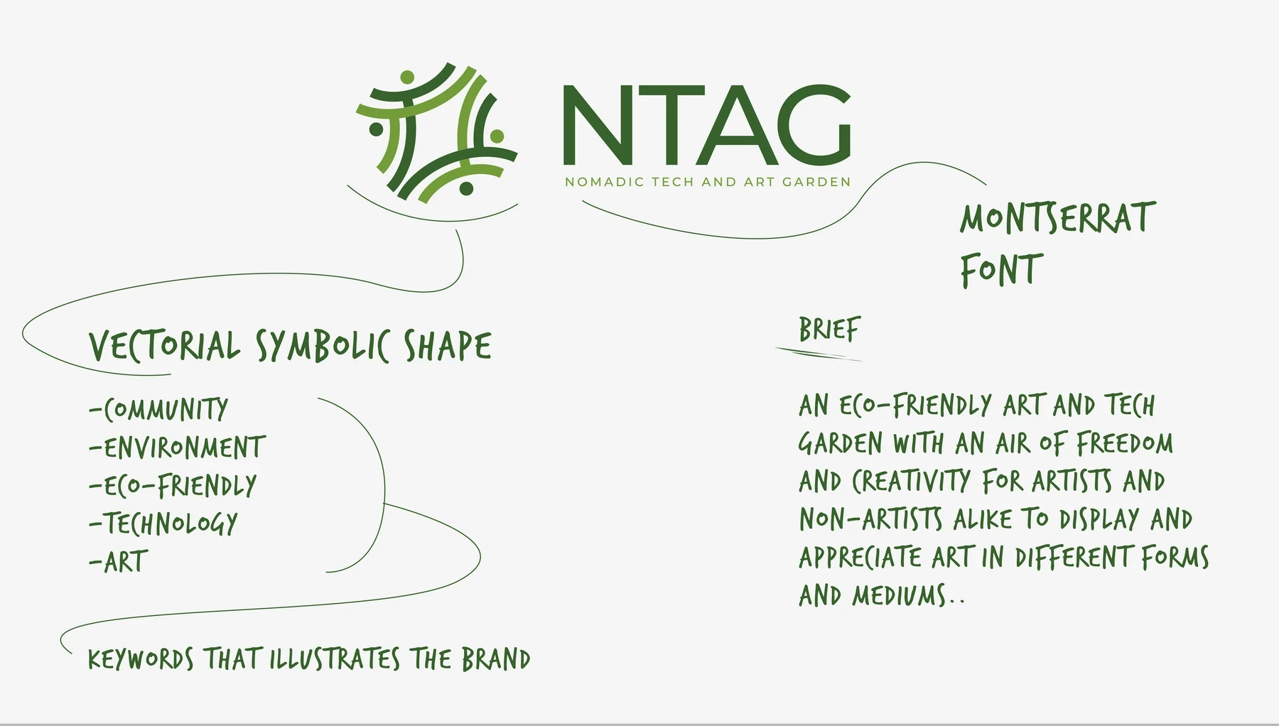
The identity therefore needs to hold several ideas together: people, creative expression, technology and the environment. The concept board names community and eco-friendliness among its central themes, giving the design a clear starting point beyond the initials alone.
Four figures around an open centre
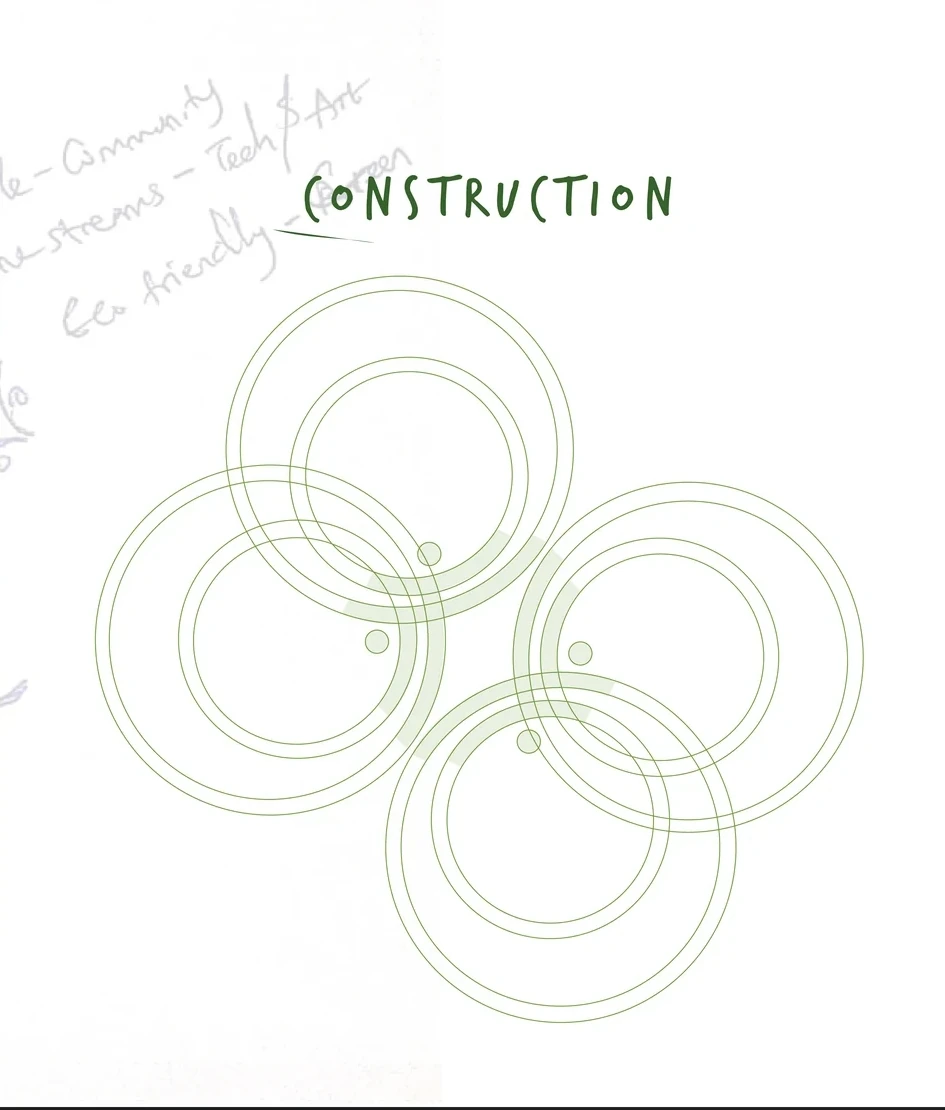
The symbol brings curved lines and small circular forms into a balanced, four-sided arrangement. Its human-like elements support the community theme, while the open centre gives the mark a sense of gathering and shared space.
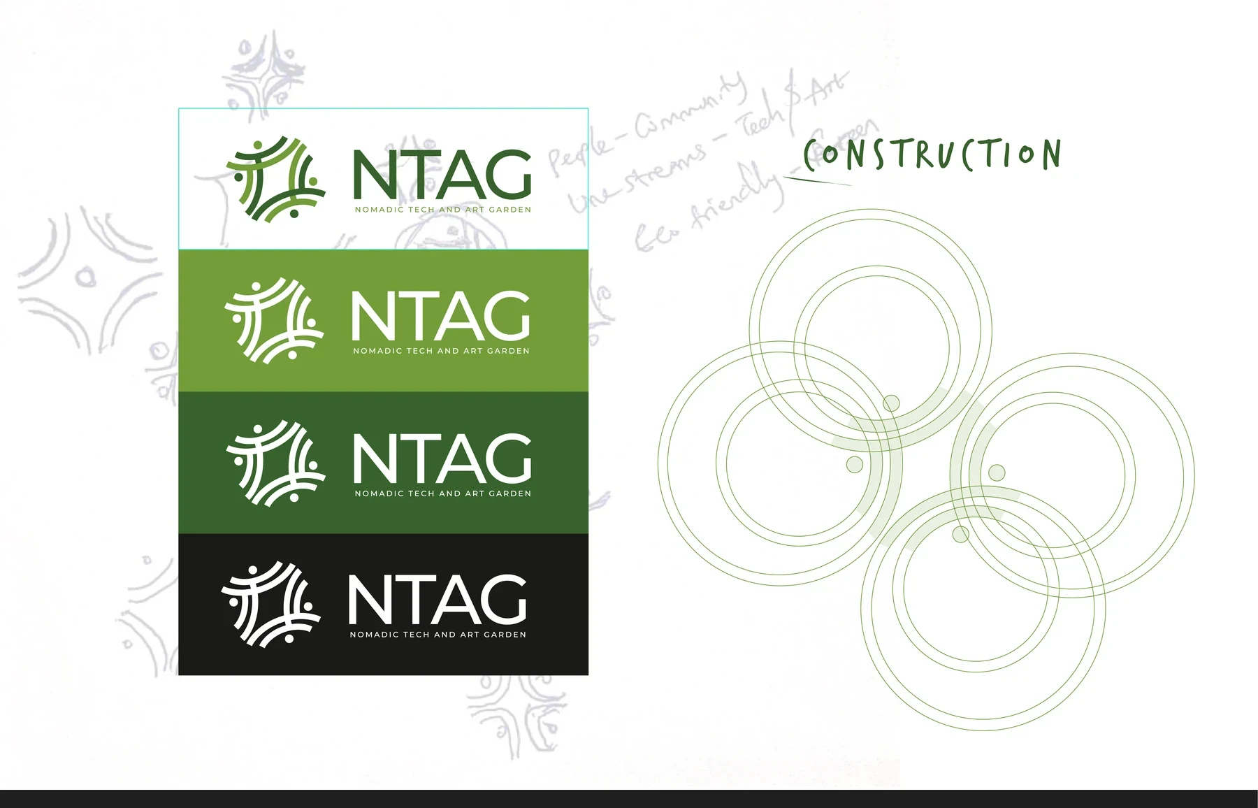
The construction study shows how repeated curves build that structure. A Montserrat wordmark sits beside the symbol, with the full name set underneath. The result combines an expressive icon with a straightforward introduction to the organisation.
A symbol that works with or without the name
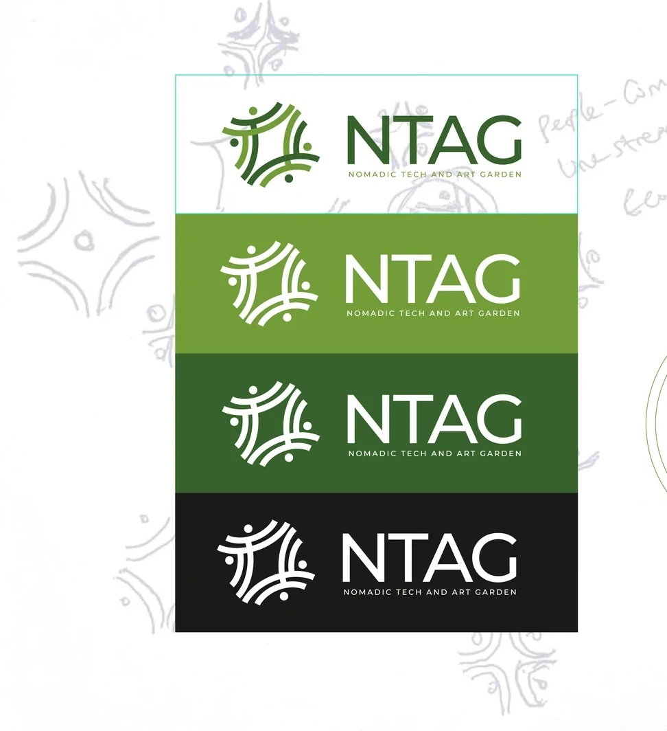
The full signature pairs the symbol with the Ntag name and its expanded descriptor. The standalone icon keeps the community motif available when the full text would be too small or too repetitive.
Green and monochrome presentations give these signatures a practical range. The same geometry remains the constant across light, dark and coloured surfaces.

Two greens, one consistent family
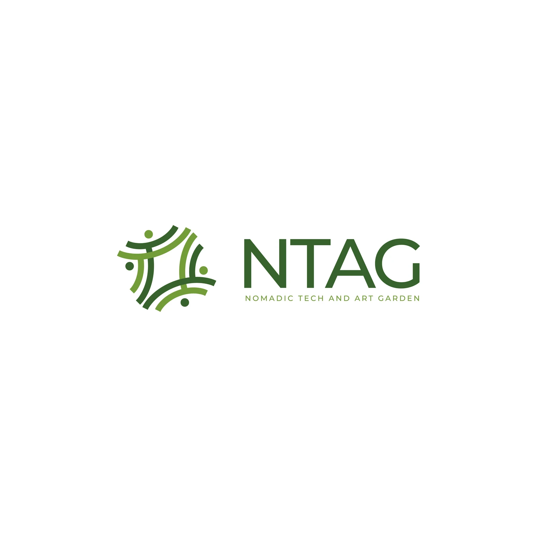
Light and dark green create the main colour relationship. The lighter tone brings energy to the system, while the darker tone supports more grounded applications. White and black provide clear alternatives when a surface or production method calls for a single colour.
The identity works as a full signature or as an icon on its own. Keeping both versions gives the brand a useful range: the full name introduces Ntag, while the symbol can identify a smaller object after the brand is already familiar.
- Montserrat
- Wordmark typography
An identity that belongs to the community
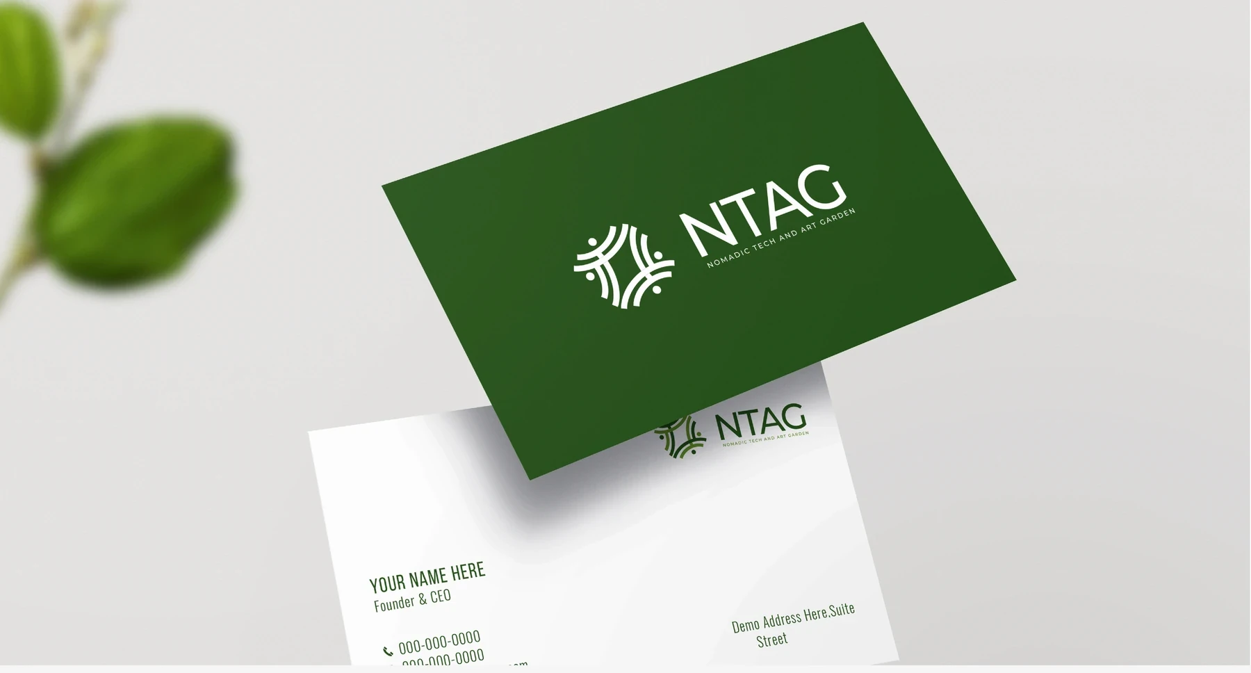
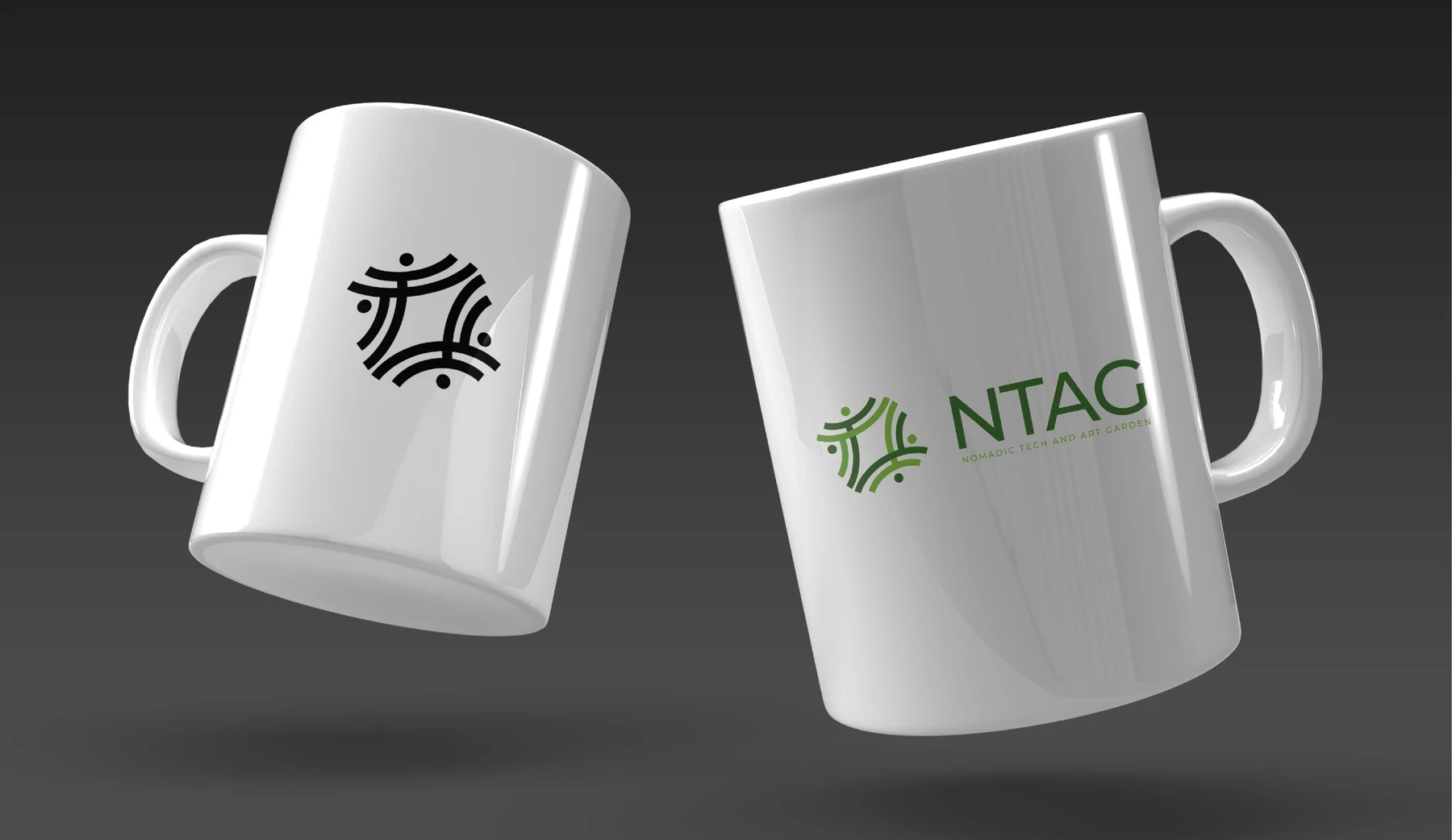
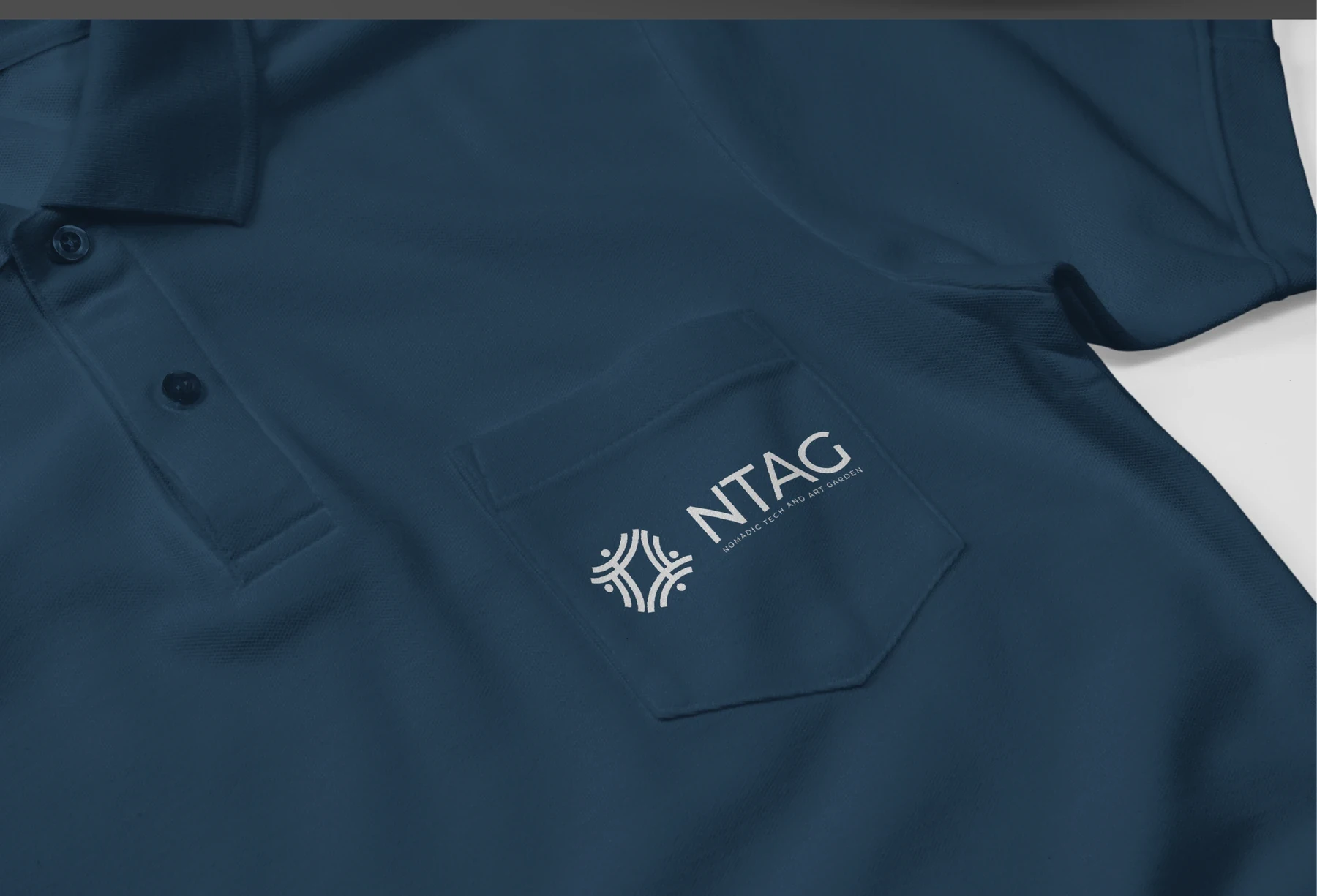
The application board moves the system into everyday objects, including stationery, mugs and a polo shirt. These examples test how the mark works both as a small personal identifier and as part of a larger printed surface.
The presentation gives the full signature room on stationery and uses the standalone icon more freely on merchandise. That distinction helps the system stay useful across different sizes without forcing every application into the same layout.
The completed identity
A community-focused identity supported by a documented concept, geometric construction and practical logo variations.
Project scope
- Symbol and Montserrat wordmark
- Construction and concept board
- Green and monochrome logo variations
- Stationery and merchandise concepts
 Let’s create your next identity