Ijele Ogazi
A foundation identity with an expressive emblem and a clear visual presence across organisational and digital communication.
- Client
- Ijele Ogazi
- Sector
- Foundation, Social impact
- Our work
- Visual Identity, Logo System, Digital Brand Applications
A foundation with a distinct visual identity
Ijele Ogazi Foundation’s brand combines an emblem-led identity with digital presentations focused on widows and community support. The branding needs to identify the organisation clearly while carrying an expressive, recognisable character.
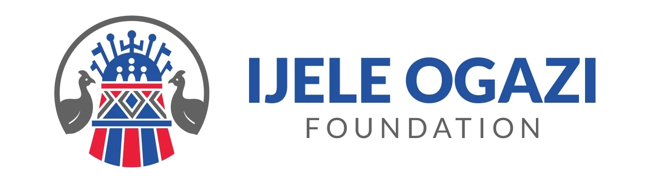
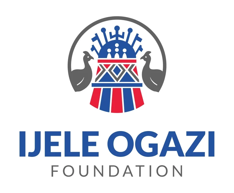
The identity provides several arrangements of the mark, including a vertical signature, a horizontal signature and a circular version. This gives the foundation different ways to introduce itself without changing the core emblem.
An emblem designed to hold detail
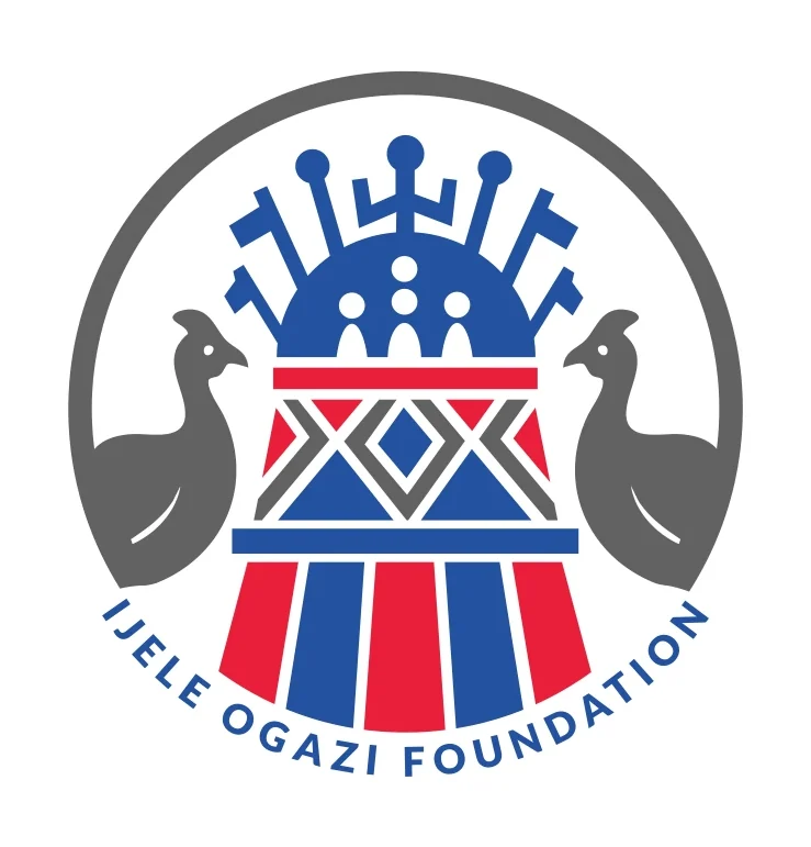
The emblem combines a central geometric structure, human-like figures and paired birds within a circular outline. Blue, red and grey create a clear separation between its different parts, helping a detailed symbol read as one organised form.
The bold name gives the emblem a strong verbal anchor. A widely spaced foundation descriptor establishes the organisation type. In the circular arrangement, the name follows the curve of the emblem, creating a compact signature for a different format.

One emblem, several ways to introduce the foundation
The horizontal signature gives the name room beside the emblem. The vertical version stacks the elements, while the circular treatment brings the foundation name around the symbol.
These variations respond to different spaces without changing the emblem itself. Keeping the artwork and its proportions consistent preserves recognition as the identity moves between formal communication and compact digital settings.
Blue, red and a measured supporting tone
The identity uses blue as the main identifying colour, red for emphasis and grey to support the emblem and descriptor. These relationships carry into the digital presentation, where blue provides the strongest recurring field.
Keeping the identity in its original form preserves the detail and proportions of the emblem. The different signatures give layouts flexibility while retaining the same core colour relationships and name treatment.
- Lato
- Name and foundation descriptor
The brand in a digital setting
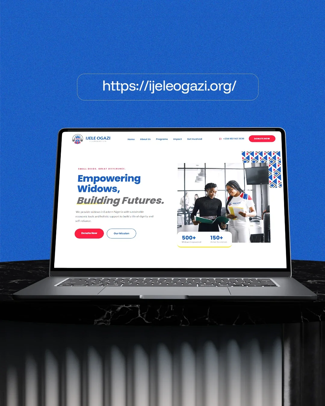
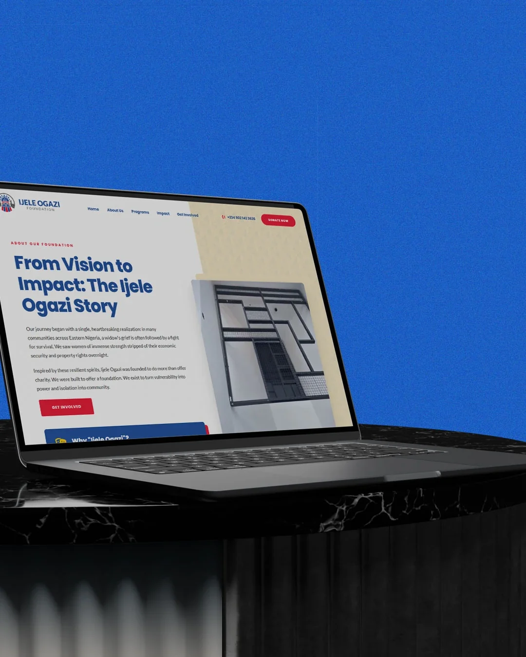
The website applications show the identity in use beside the foundation’s message and calls to participate. They demonstrate how the logo and colour system can support a larger communication environment rather than appearing only on an isolated logo sheet.
For this branding case study, the digital examples are shown as applications of the identity. They focus on visual continuity, hierarchy and recognition. The foundation’s website design can be explored separately as the wider portfolio develops.

The completed identity
An emblem-led foundation identity with vertical, horizontal, circular and standalone formats, supported by digital brand applications.
Project scope
- Original full-colour emblem
- Vertical and horizontal signatures
- Circular signature and standalone icon
- Digital brand-application presentation
 Let’s create your next identity