Joluxe
A jewellery identity built around deep green, warm gold and the detail of the object itself.
- Client
- Joluxe
- Sector
- Jewellery, Fashion & retail
- Our work
- Brand Identity, Logo System, Packaging Direction, Brand Applications
A considered identity for jewellery
Joluxe brings jewellery and accessories into a visual world of rich colour, fine detail and restrained typography. The identity needs to introduce the name clearly while leaving room for the jewellery to remain the focal point.
The design task extends beyond a single logo. Jewellery appears at very different scales, from a small earring card to a presentation box or a shop window. The system therefore pairs a compact standalone symbol with a fuller wordmark and a consistent approach to colour and application.
A symbol with a jewellery-like rhythm
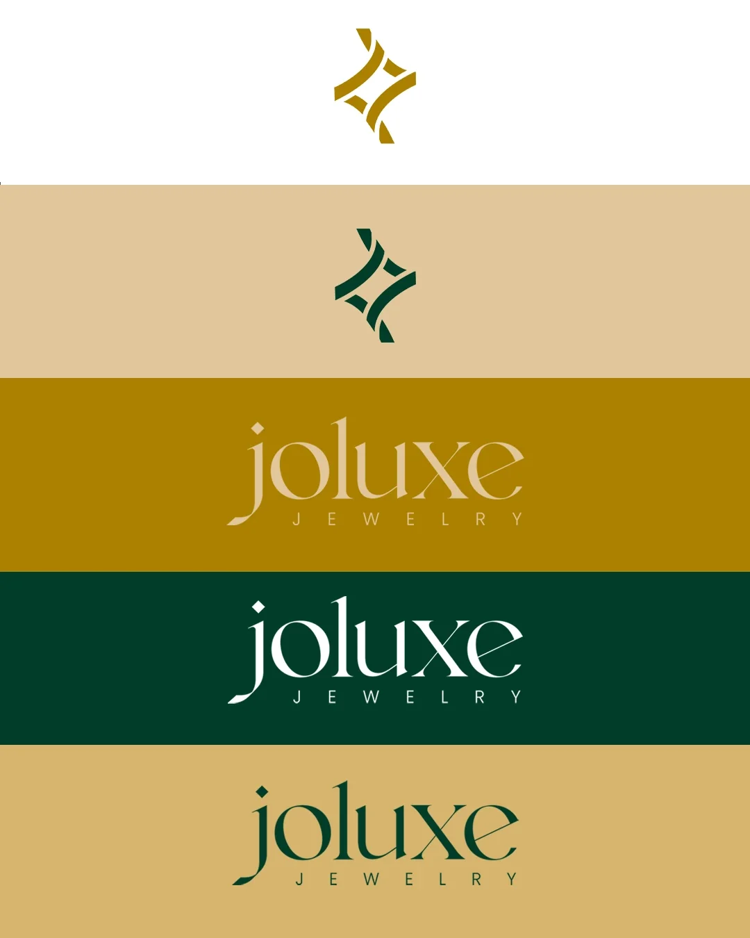
The mark brings angular, interlocking strokes into a compact ornamental form. It gives the identity a small, distinctive element that can appear on a box lid, product tag or social profile without relying on the full name.
The wordmark provides a quieter counterpoint. Its fine, contrasting letterforms give the name an editorial quality, while the widely spaced jewellery descriptor establishes the category. The combination lets the symbol carry the decorative character and keeps the name easy to recognise.

The symbol becomes a complete identity
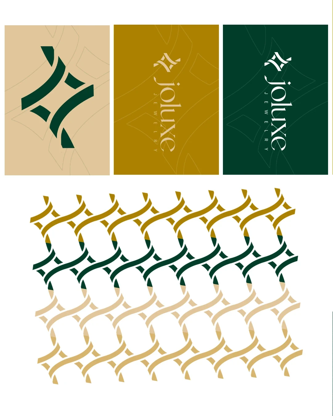
The standalone mark gives small surfaces a recognisable signature. The fuller wordmark introduces the name and jewellery descriptor, allowing the identity to work both as an ornament and as a clear label.
The same visual language extends into category icons and several colour presentations. This creates a family of assets for different uses, with the primary logo carrying the name and supporting symbols adding detail where it is useful.
Green, gold and a repeatable pattern
Deep green anchors the presentation, with gold and warm neutral tones giving the jewellery room to stand out. White provides a clear alternative for smaller printed pieces and layouts that need a lighter background.
The symbol also becomes a repeat pattern. Repetition adds texture to otherwise simple surfaces and allows packaging to feel related even when the full wordmark appears only once. The palette, pattern and supporting icons give the identity several ways to remain recognisable.
The experience around the product
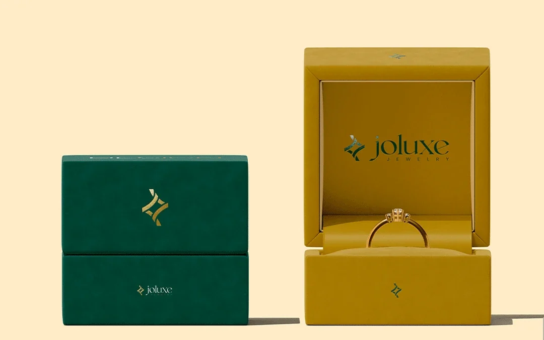
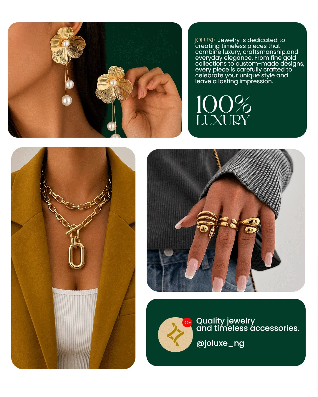
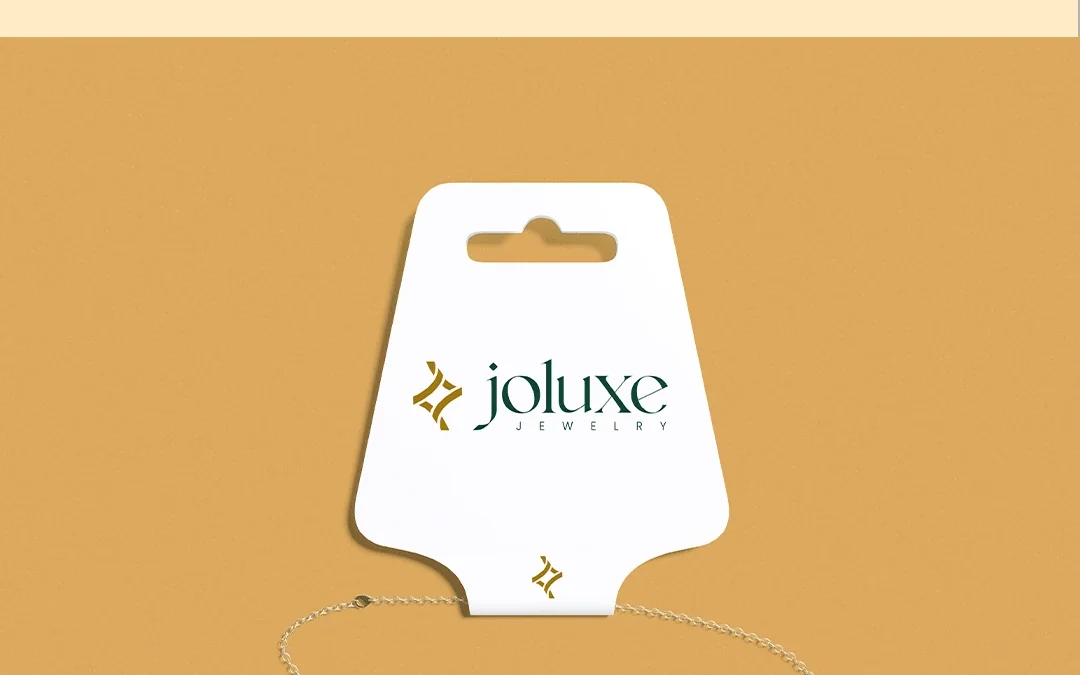
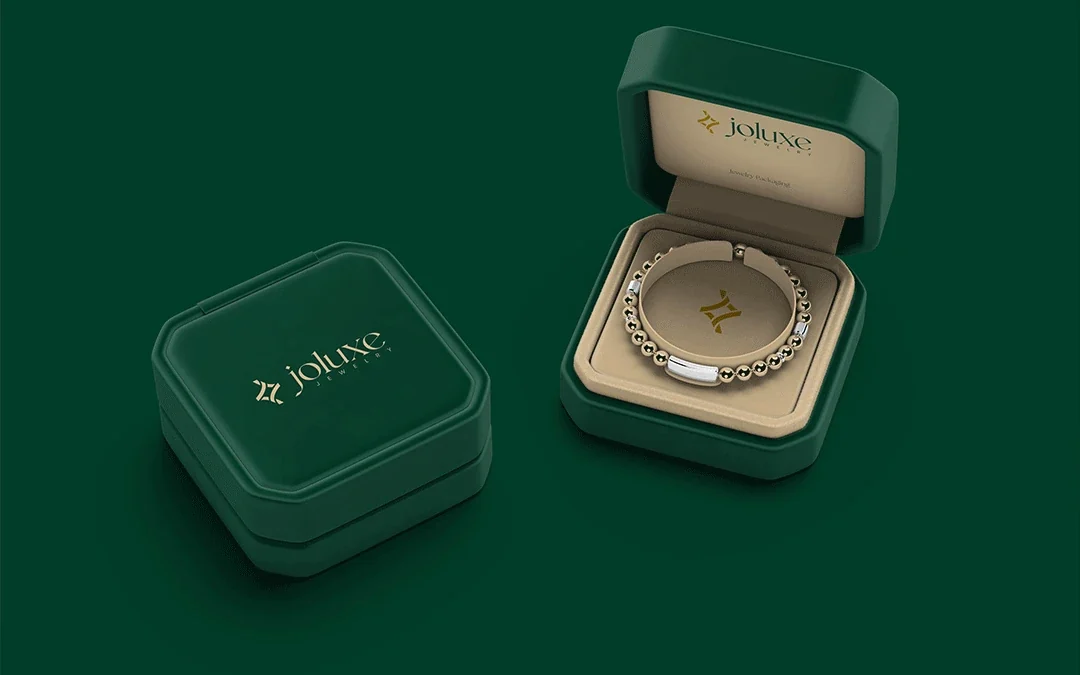
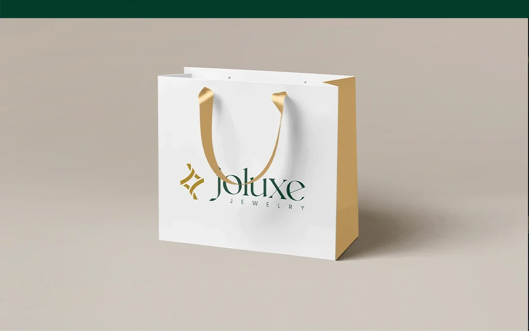
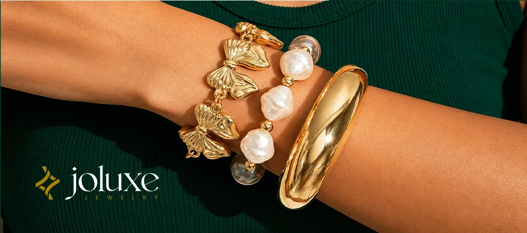
Packaging is a central part of how this identity comes to life. The presentation explores jewellery boxes, an earring card, a compact case and a shopping bag. Each surface calls for a different balance between the symbol, full name and open space.
Small applications use the mark as a clear identifier. Larger surfaces give the wordmark more room. Across both, the green-and-gold relationship provides continuity, allowing the packaging to support the jewellery rather than compete with it.
A recognisable presence at retail scale
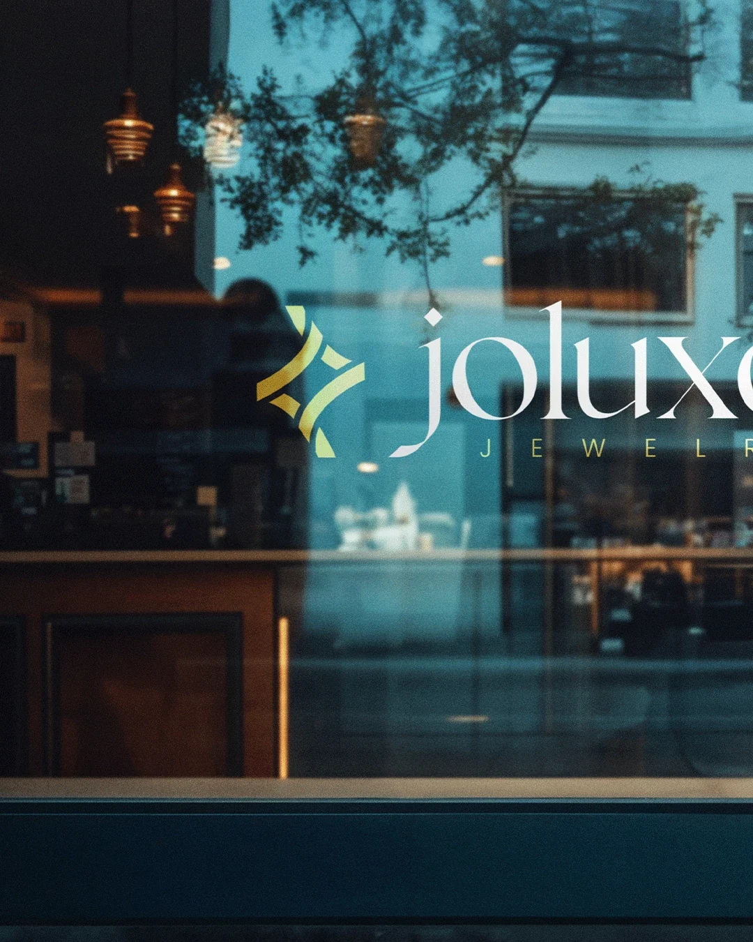
The storefront presentation tests the same identity at a larger scale. The name and symbol remain the main elements, showing how the design can move from intimate packaging to a public-facing retail setting.
Together, these applications present Joluxe as one coherent visual experience. The recognisable mark, restrained wordmark and repeated palette give future pieces a clear starting point without requiring every layout to look identical.

The completed identity
A coordinated jewellery identity with a flexible logo system and a consistent visual direction across packaging, product presentation and retail applications.
Project scope
- Primary wordmark and standalone symbol
- Colour variations and supporting iconography
- Repeat pattern
- Jewellery packaging and retail application concepts
 Let’s create your next identity