Zovara
An identity for a Nigerian energy enterprise, designed to communicate structure today and support a broader ambition tomorrow.
- Client
- Zovara
- Sector
- Energy distribution, Enterprise
- Our work
- Brand Strategy, Visual Identity, Brand Guidelines, Corporate Applications
- Project date
- June 2026
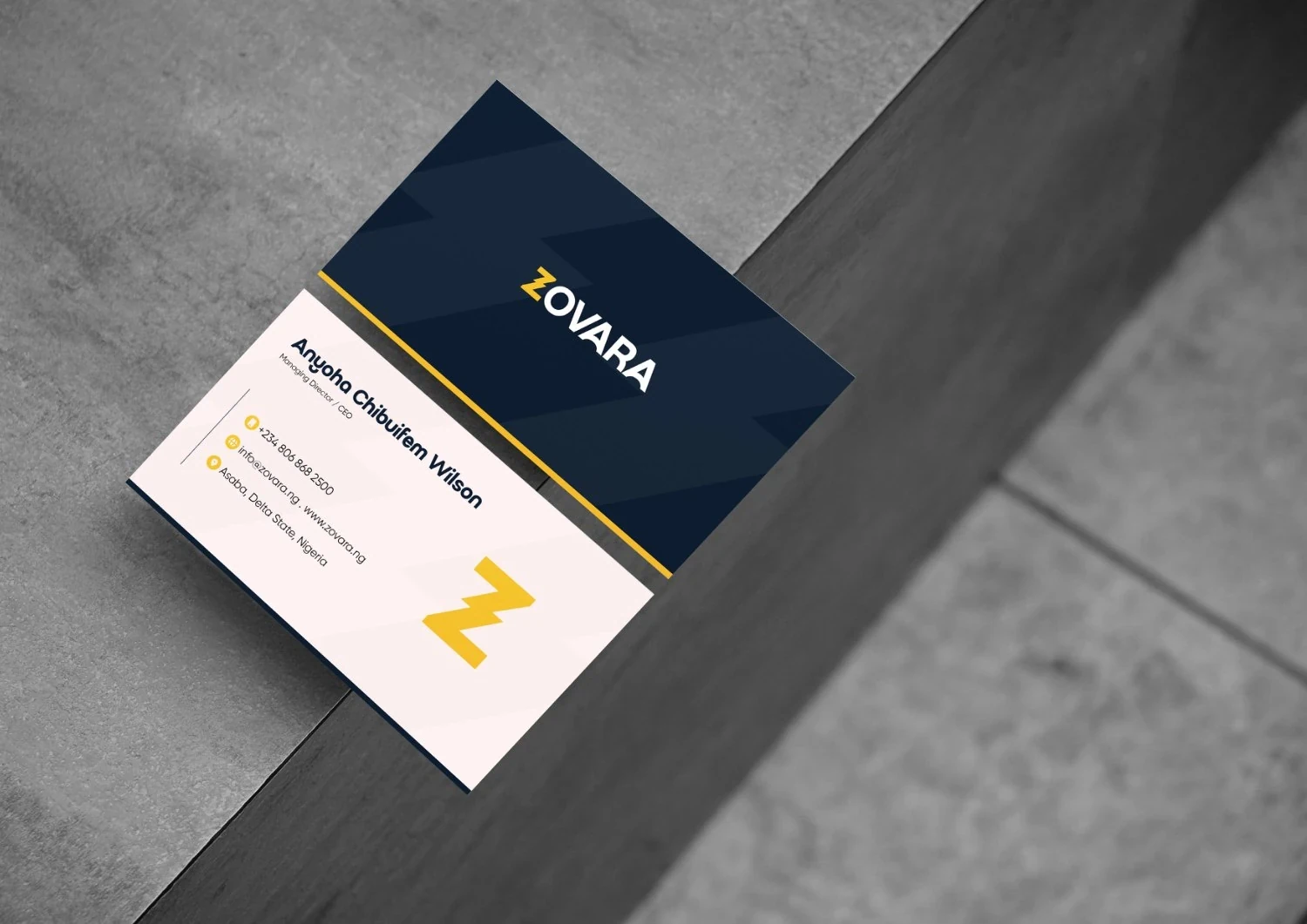
Energy today, a wider enterprise tomorrow
Zovara Nig Ltd begins in energy distribution, with a long-term vision for growth across other sectors of the Nigerian economy. Its brand guide describes an enterprise built around reliability, structure and innovation, rather than a business defined by a single product.
That creates a specific identity challenge: establish credibility in an operational industry while keeping the visual language broad enough for future expansion. The resulting system combines a direct wordmark, a compact geometric symbol and a disciplined corporate palette.
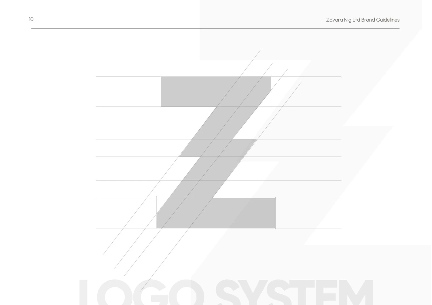
A geometric Z as the starting point
The Z provides a direct link to the name and a compact shape for smaller applications. Its angular geometry gives the identity a structured character, while the construction study makes the form clear independently of the full wordmark.
The brand guide connects this geometry with strength, ambition and progress. The concept establishes a visual foundation that can support an energy-distribution business without making every application depend on literal industry imagery.
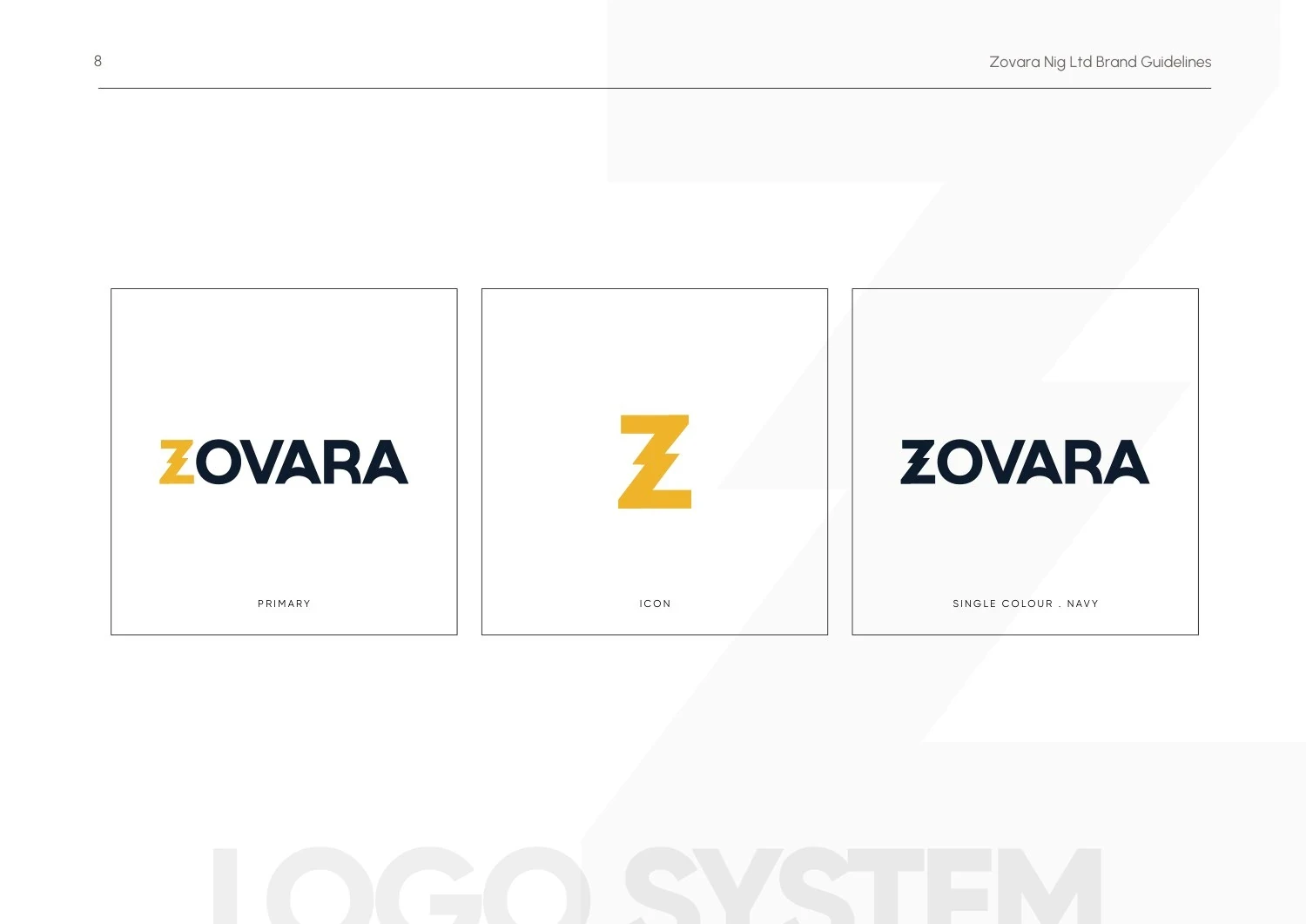
A family of clear brand signatures
The primary wordmark introduces Zovara, while the Z icon provides a compact alternative. The guide documents both formats alongside a single-colour version, making the relationship between the full name and the standalone identifier explicit.
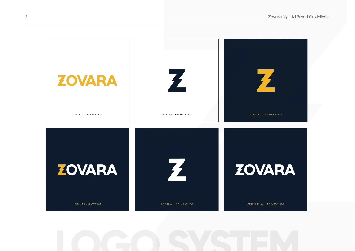
Approved light- and dark-background treatments give the system a controlled range. The variations preserve the same geometry and proportions while adapting the contrast to the surface.
A palette with institutional weight
Deep navy provides the stable foundation. Gold adds emphasis and a sense of value without becoming the dominant background everywhere. Supporting navy and gold tones give layouts room to vary while staying within the same family.
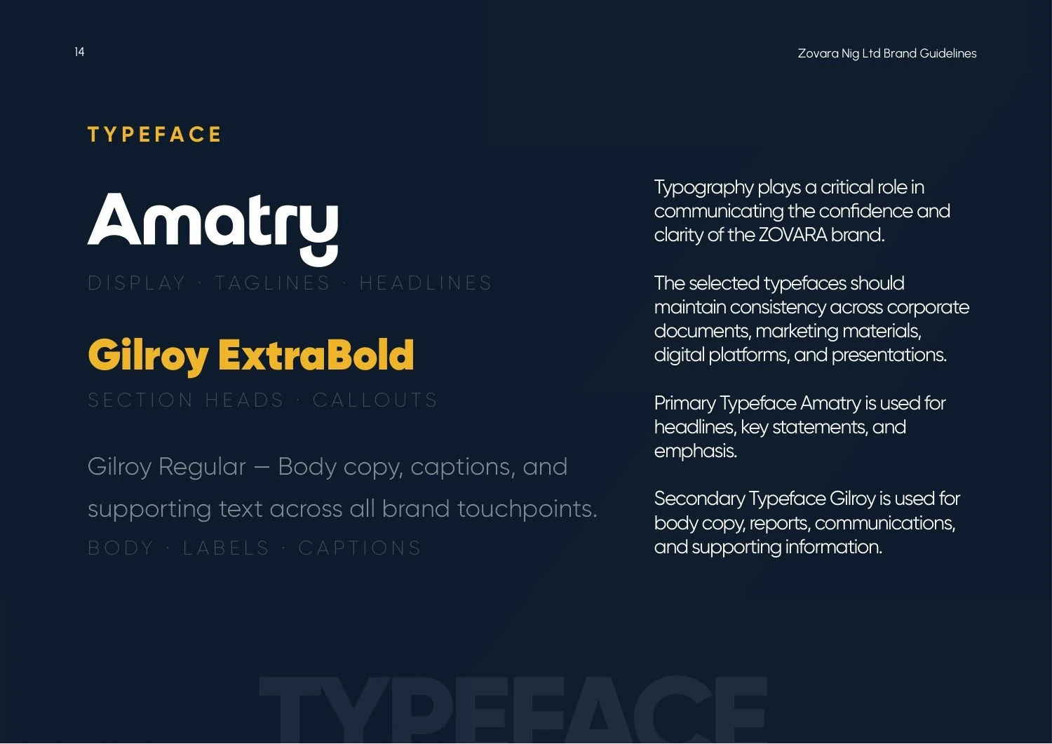
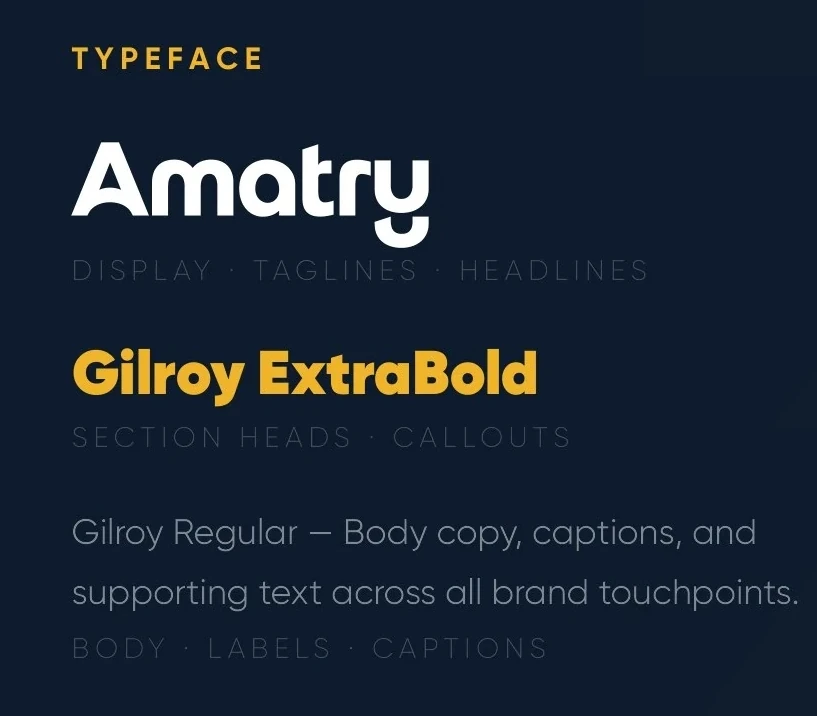
The typography system names Amatry for display use and Gilroy for supporting communication. The guide distinguishes headline, section-heading and body-copy roles, creating a hierarchy that can carry through corporate documents, presentations and digital layouts.
- Amatry
- Display and headlines
- Gilroy
- Supporting communication
The identity also has a way of speaking
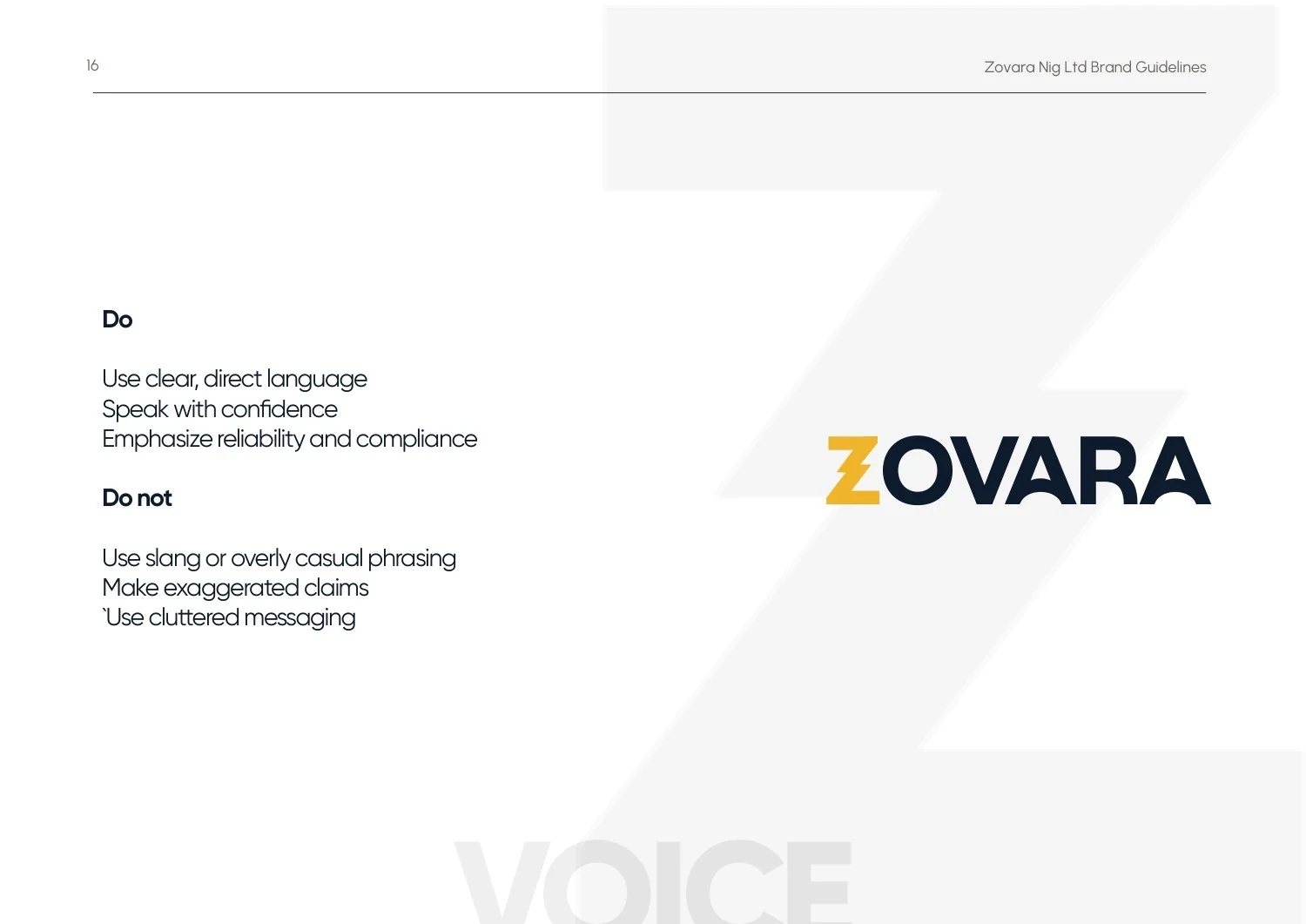
The guide extends the system into language. It asks for clear, direct communication, a confident tone and an emphasis on reliability and compliance. It also discourages slang, cluttered messaging and exaggerated claims.
This matters because the visual identity and the written message need to support the same impression. A disciplined layout loses its value if the accompanying copy feels inconsistent. These rules give future communication a shared reference alongside the logo and colours.
A system for everyday business
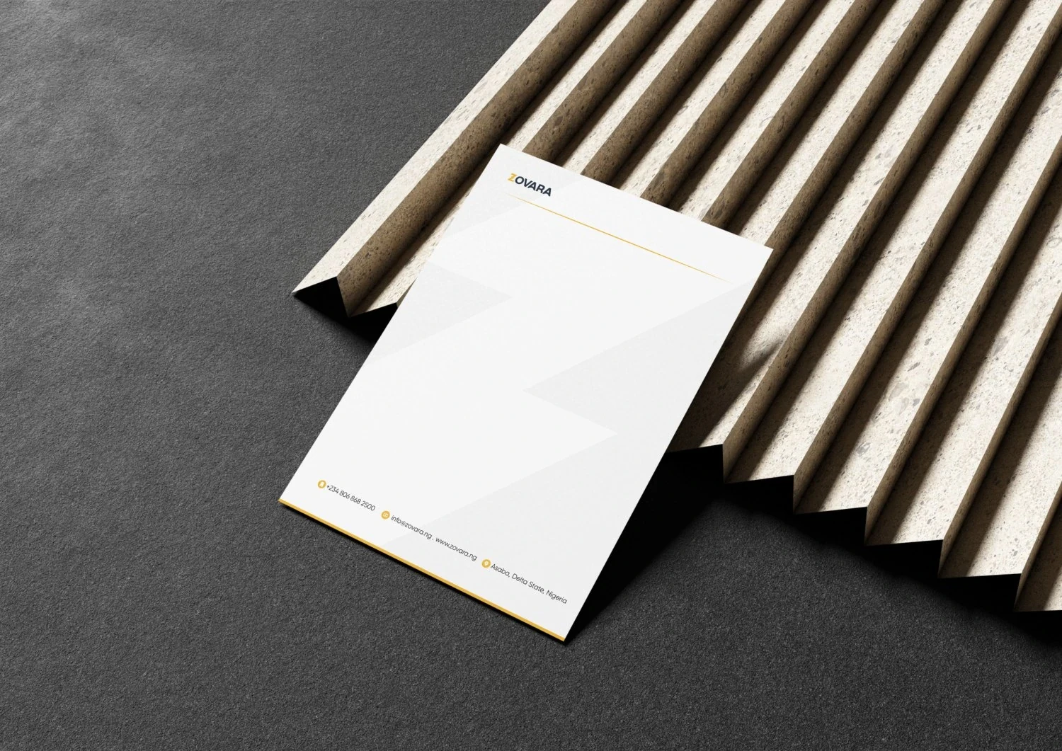
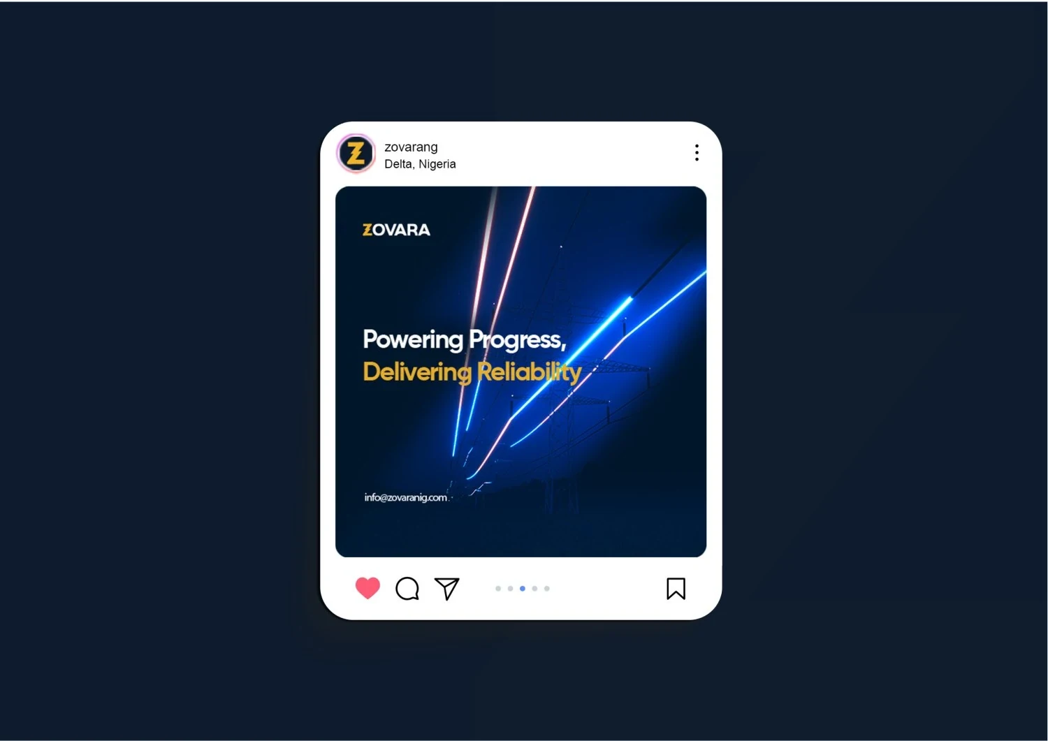
The application work takes the identity beyond its logo sheet. Business cards and letterhead use the geometric mark as a recurring element, while social layouts show how the palette and typography can structure digital communication.
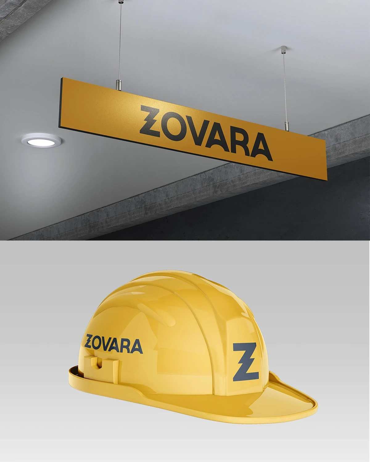
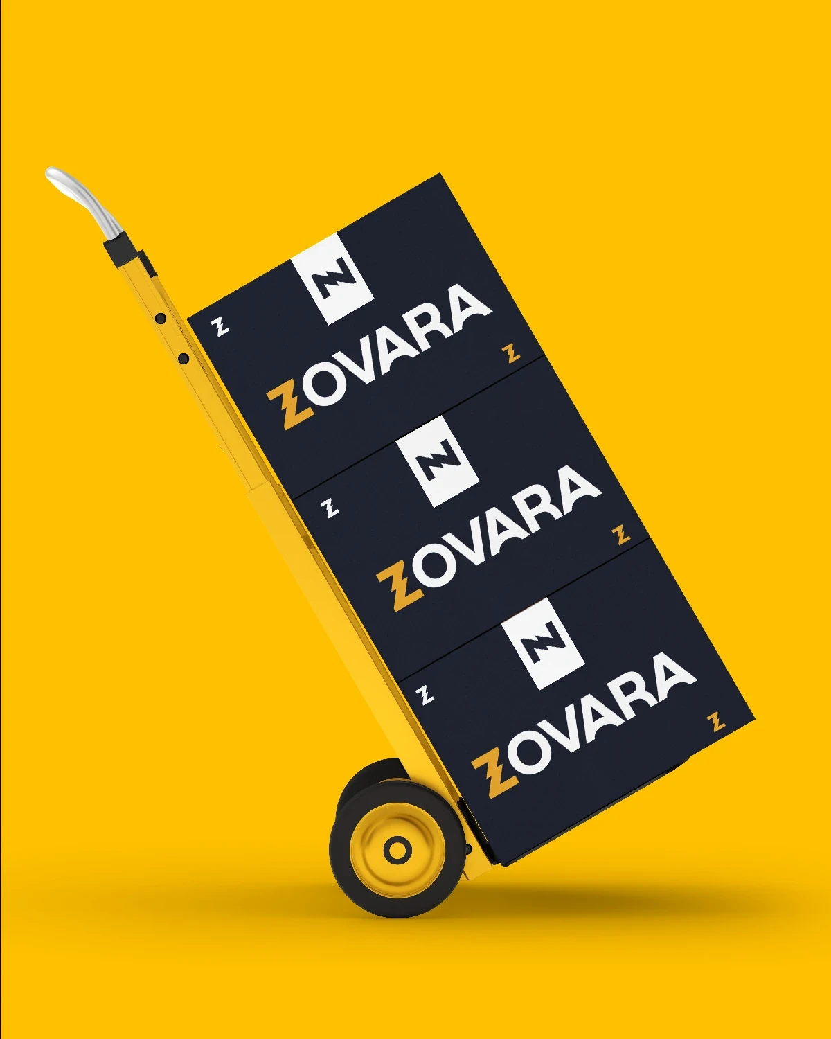
The wider presentation also explores signage, protective headwear and other operational touchpoints. These are application concepts demonstrating scale and consistency. The identity remains recognisable whether it appears as a small document signature or a larger environmental graphic.

The completed identity
A documented identity system covering positioning, logo usage, typography, colour, tone of voice and business applications.
Project scope
- Brand positioning and personality
- Logo system and usage guidance
- Colour and type specifications
- Brand voice
- Corporate, digital and operational application concepts
 Let’s create your next identity