Rygem
A rebrand for desserts, pastries and catering, built around a distinctive wordmark and a cake-inspired symbol.
- Client
- Rygem
- Sector
- Food & beverage, Catering
- Our work
- Rebranding, Logo Design, Visual Identity, Brand Applications
A new name with a stronger visual centre
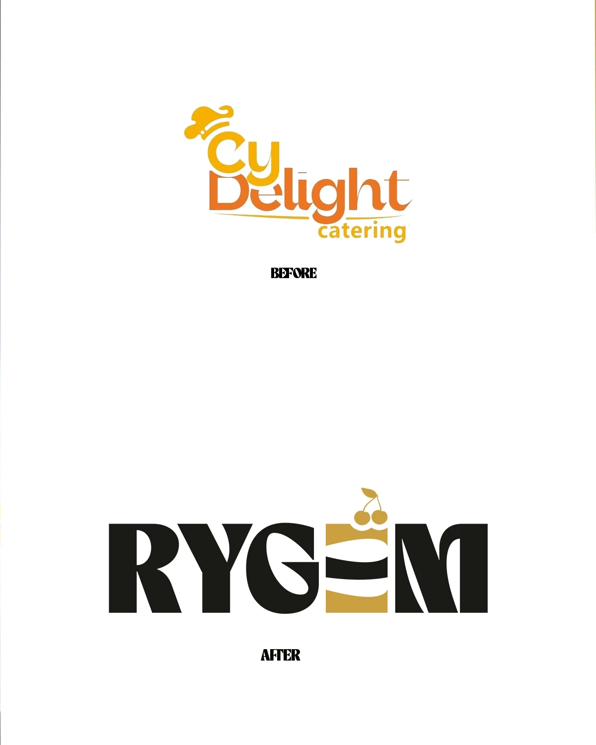
The rebrand records a move from Cy Delight Catering to Rygem. The new identity needs to introduce that name clearly while retaining an immediate connection to desserts, pastries and catering.
The work puts the wordmark at the centre of the system. Rather than treating the food category as a separate decorative addition, it builds a cake-like form into the lettering and carries that detail through packaging and display concepts.
The product becomes part of the name
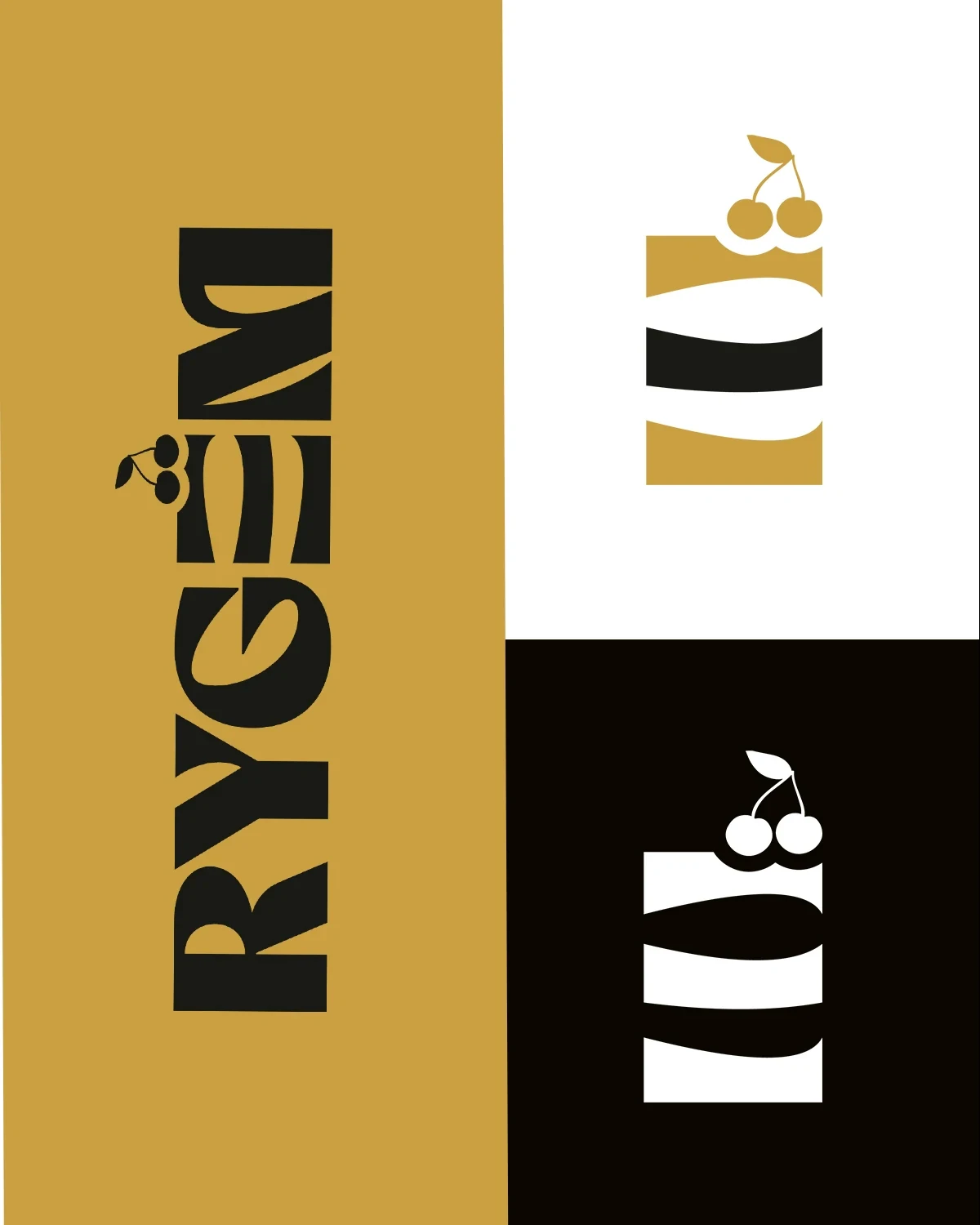
The bold wordmark combines expressive letterforms with a layered cake motif. The small fruit detail above it helps communicate the product category without relying on a long descriptor.
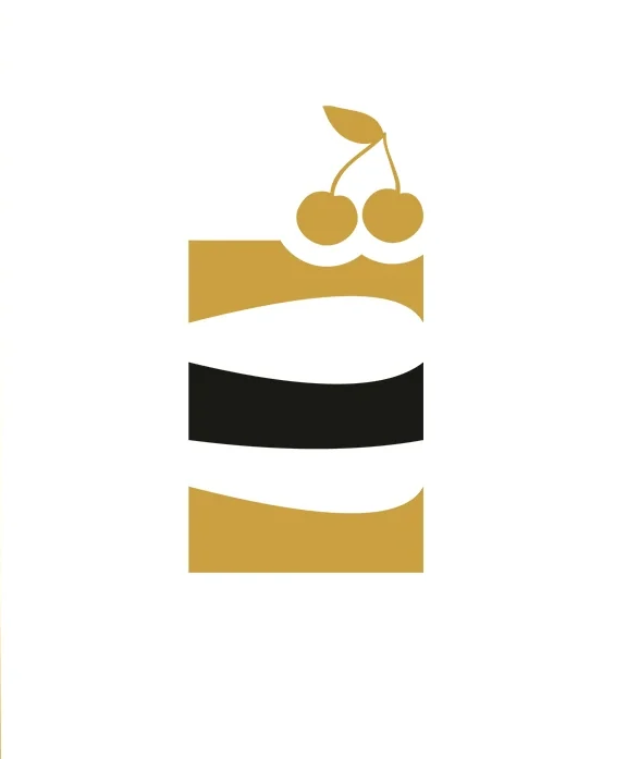
That cake element also works independently. Used as a separate symbol, it gives smaller surfaces a recognisable identifier. The presentation tests both white-on-dark and dark-on-light treatments, allowing the identity to remain legible across a range of materials.
A wordmark with a product connection
The cake motif also appears within the Rygem name. This connection gives the wordmark a category reference while allowing the symbol to operate independently on smaller surfaces.
The black, white and gold treatments test how the identity reads against contrasting backgrounds. The family shares the same proportions and distinctive cake detail rather than introducing a separate symbol for each use.
A pattern with a direct link to the logo
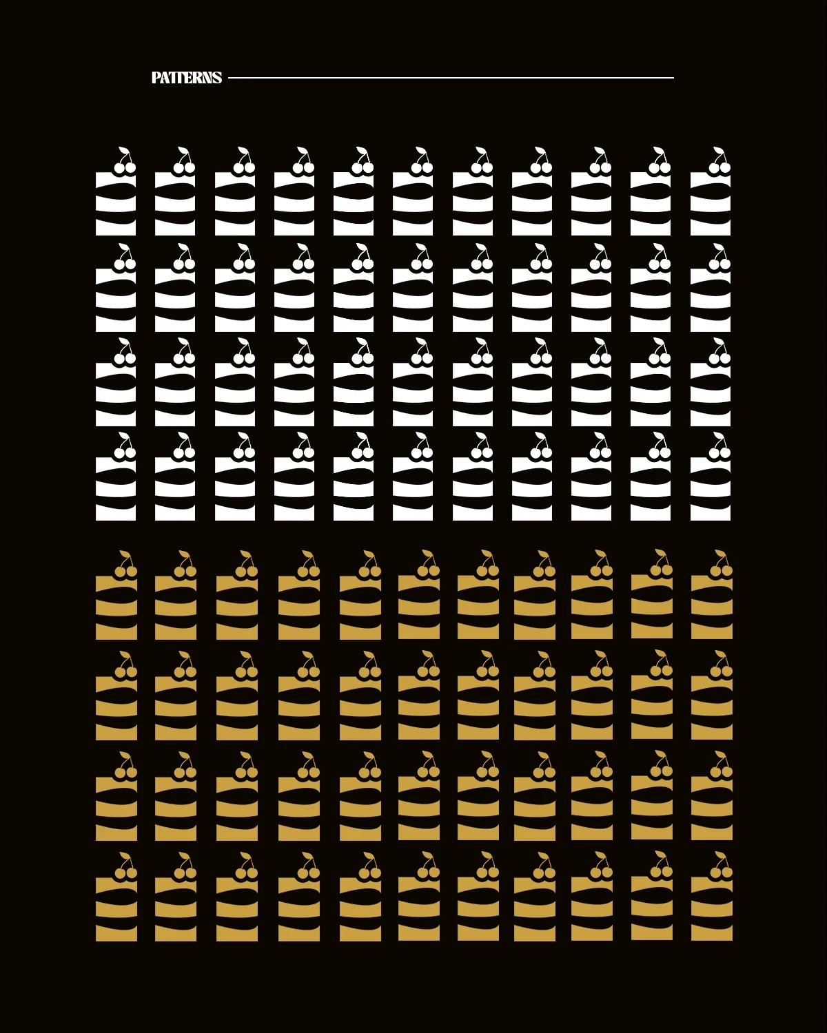
Black, warm gold and pale neutral tones form the main colour relationships. The restrained palette lets food photography provide richness and detail, while the identity remains clear and consistent around it.
Repeating the cake symbol creates a branded pattern. This gives liners, packaging or display backgrounds an additional graphic element that comes directly from the identity. The pattern can support the wordmark without introducing an unrelated visual language.
From the pastry box to the event table
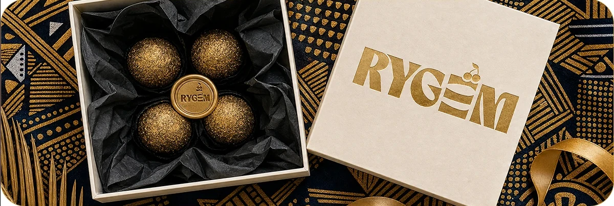
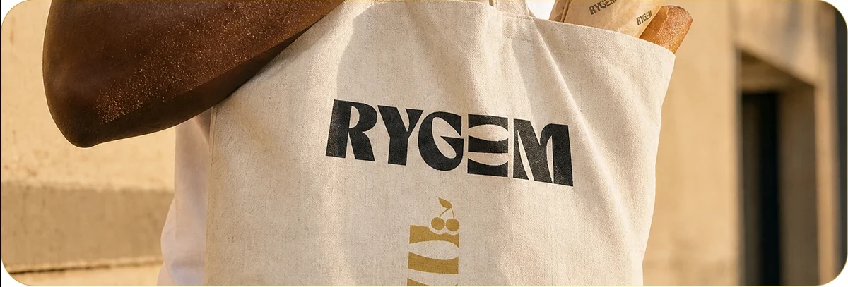
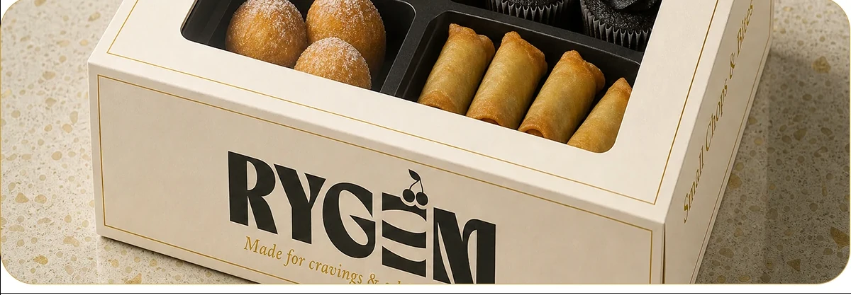
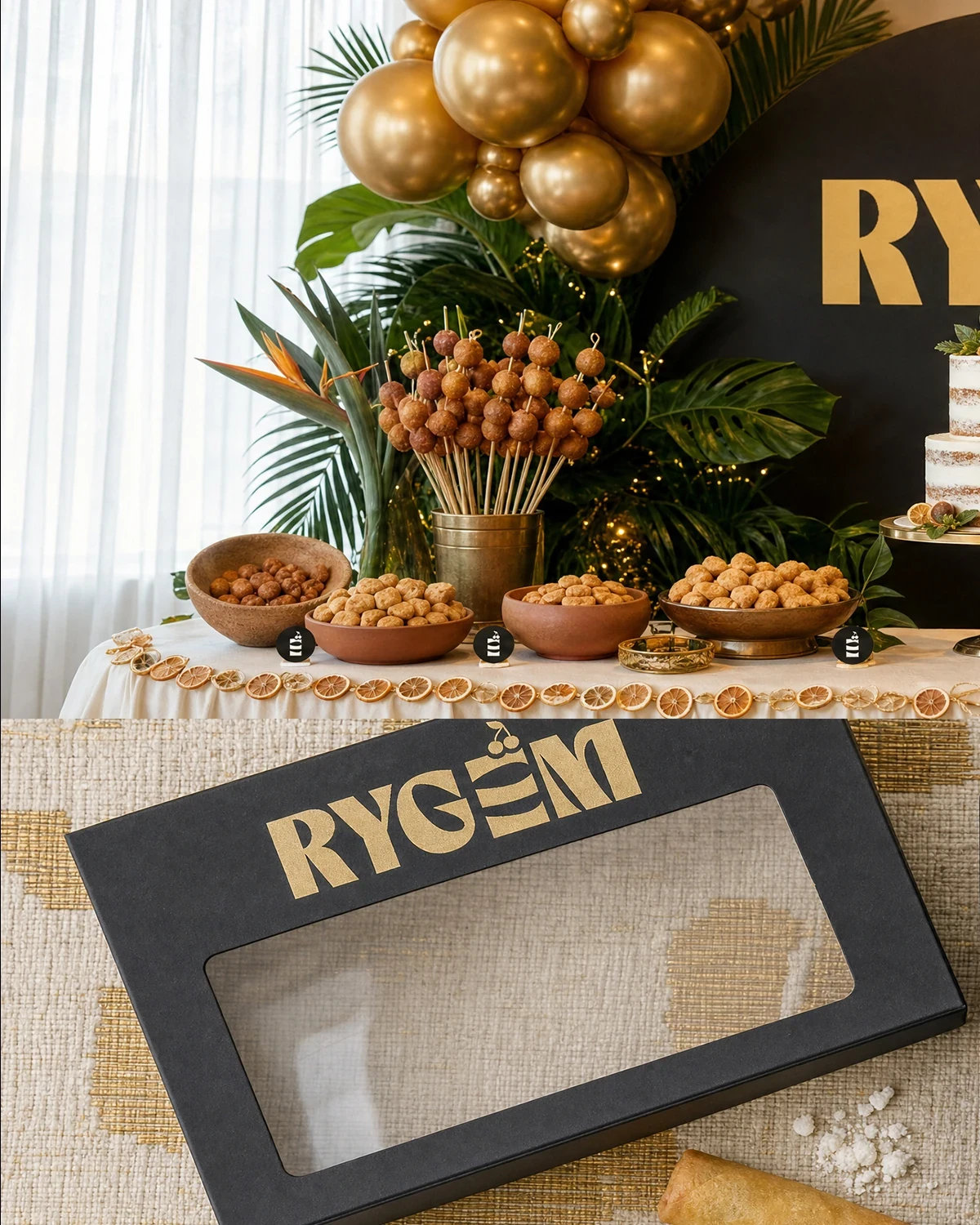
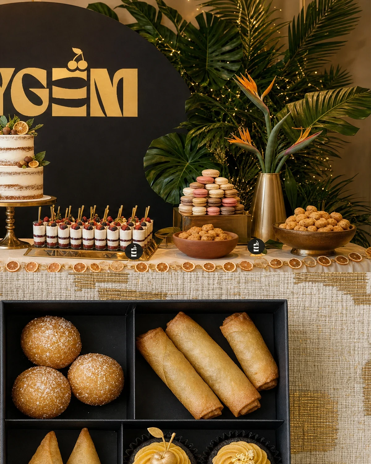
The applications show the rebrand at the point where customers encounter the product: a box of pastries, staff apparel and an event display. The mark needs enough presence to remain visible among food, flowers and other visual detail.
The packaging concepts use a generous logo placement and clear contrast. At event scale, the same wordmark appears as part of the setting, linking the individual products to a larger branded presentation.
The completed identity
A rebrand with a recognisable wordmark, a useful standalone symbol and a consistent direction for packaging and catering presentation.
Project scope
- Before-and-after identity development
- Primary wordmark and cake symbol
- Colour direction and repeat pattern
- Packaging, apparel and event-display concepts
 Let’s create your next identity