VeerPay
A gaming payments identity that turns intersecting wallets into a recognisable V-and-P signature.
- Client
- VeerPay
- Sector
- Financial technology, Gaming & esports
- Our work
- Brand Identity, Logo System, Brand Guidelines, Digital Applications

A payments identity for the gaming community
VeerPay’s branding brief centres on the financial interactions around gaming: players, creators and esports professionals. It positions the platform as a way to make those interactions more accessible, with a visual identity that feels clear and trustworthy within a digital setting.
The design needs to communicate the payment category without losing its connection to gaming. The work focuses on a compact symbol, a clear wordmark and a range of responsive versions, giving the brand a recognisable starting point across small interfaces and larger communication.
Two wallets, one distinctive signature
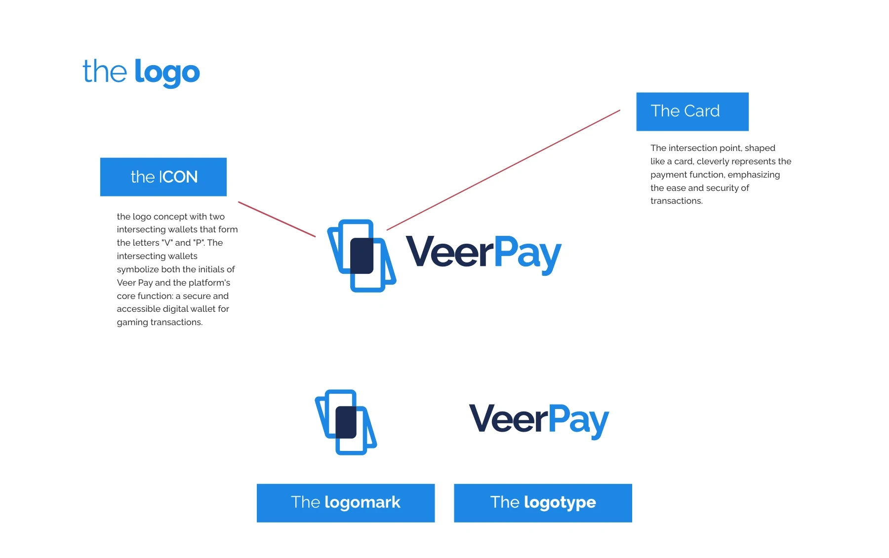
The logo concept brings two intersecting wallet forms together to suggest the initials V and P. Their overlap creates a central card-like shape, making the payment reference part of the symbol rather than an additional illustration.
The wordmark distinguishes Veer and Pay through the two primary blues. On darker surfaces, a white version retains the same silhouette. This creates a direct relationship between the name, the product category and a symbol that can stand independently.

A format for each scale
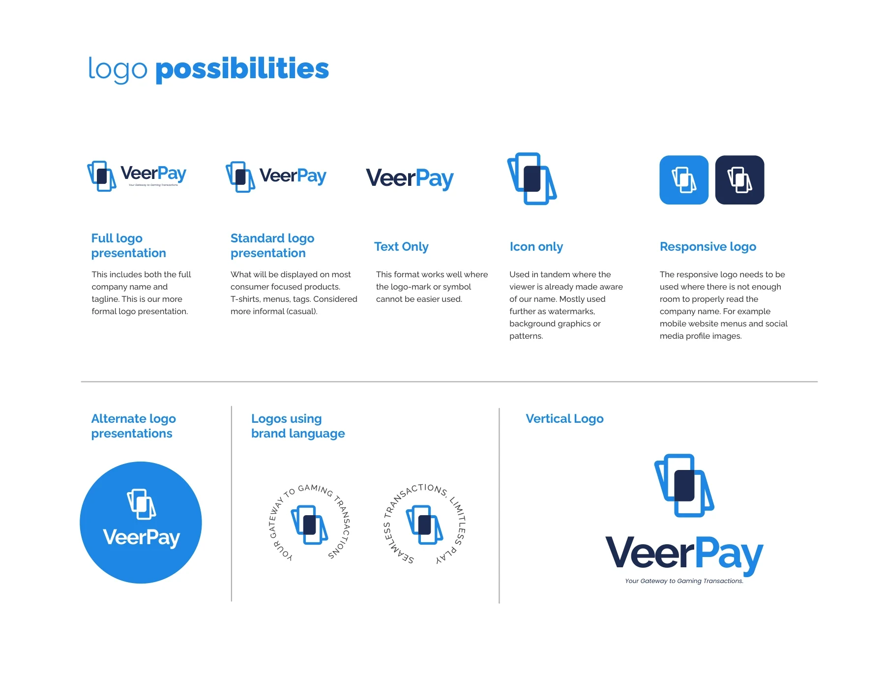
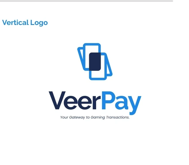
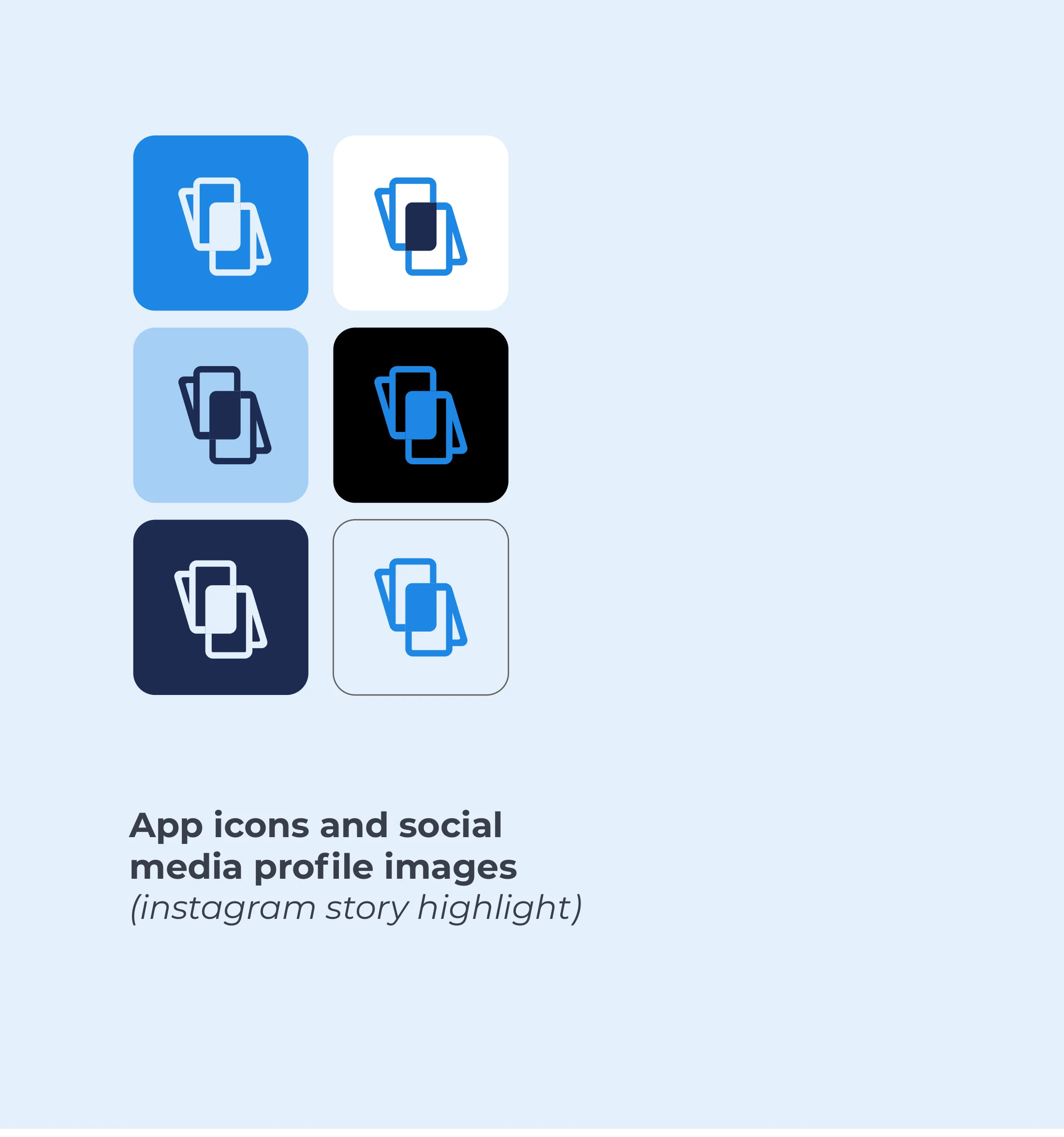
The identity system includes horizontal and vertical signatures, text-only versions, an icon and compact responsive treatments. The full signature introduces the brand, while the icon can work in places where the name would become too small to read.
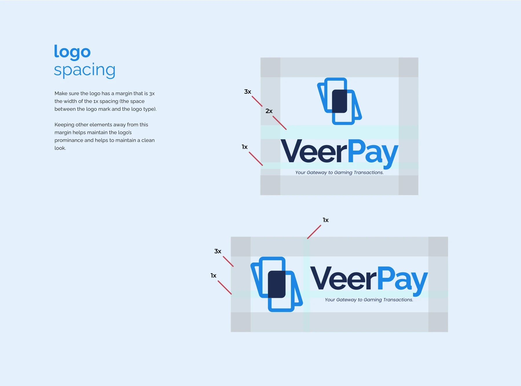
Clear-space guidance gives these variations a shared rule for separation from surrounding elements. The goal is to preserve the mark’s silhouette and give the wordmark enough room, whether it appears in a website header, a social avatar or a printed layout.


Blue for energy, navy for structure
The palette pairs deep navy with a brighter blue, supported by light blue, a pale tint, black and white. The darker tone grounds the identity, while brighter blue provides a clear accent and a second way to distinguish the symbol and name.
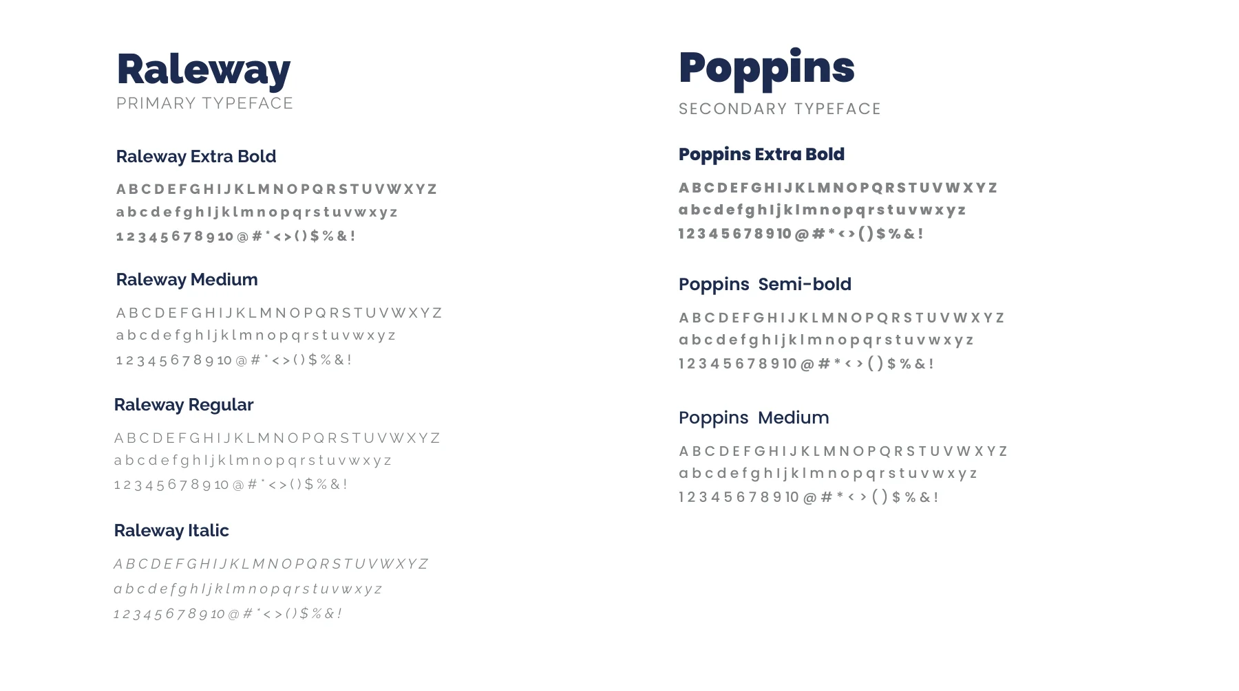
Raleway serves as the primary typeface, with Poppins providing supporting typography. The documented range of weights gives the identity a hierarchy for headlines and longer communication. A repeat pattern built from the icon provides an additional graphic layer when the full wordmark is not needed.
- Raleway
- Primary typeface
- Poppins
- Secondary typeface

Recognition in small digital spaces
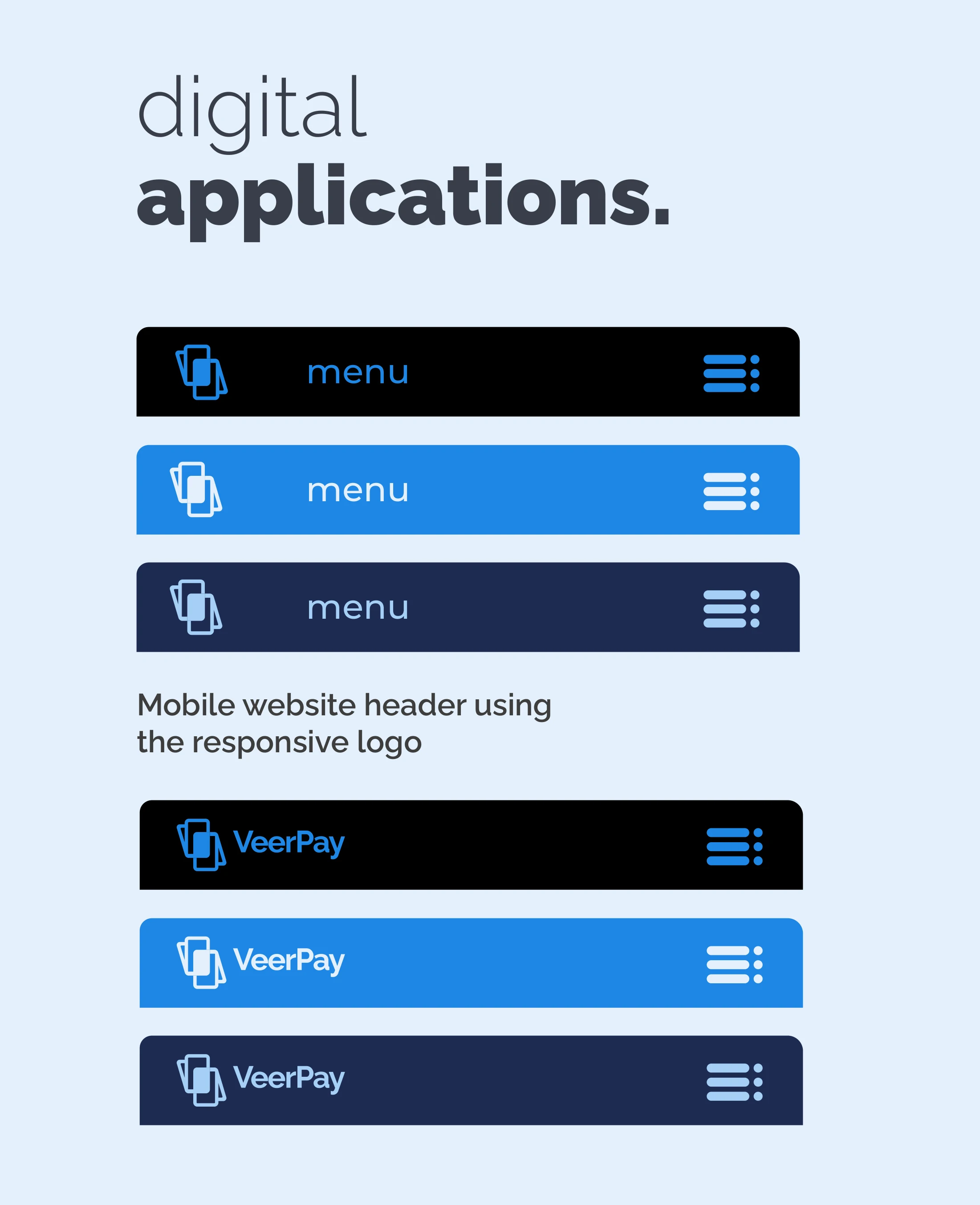
The application study tests the brand in mobile headers, app-style icons and social-profile formats. These settings demand a more compact identity than a full presentation cover, so the icon carries more of the recognition work.
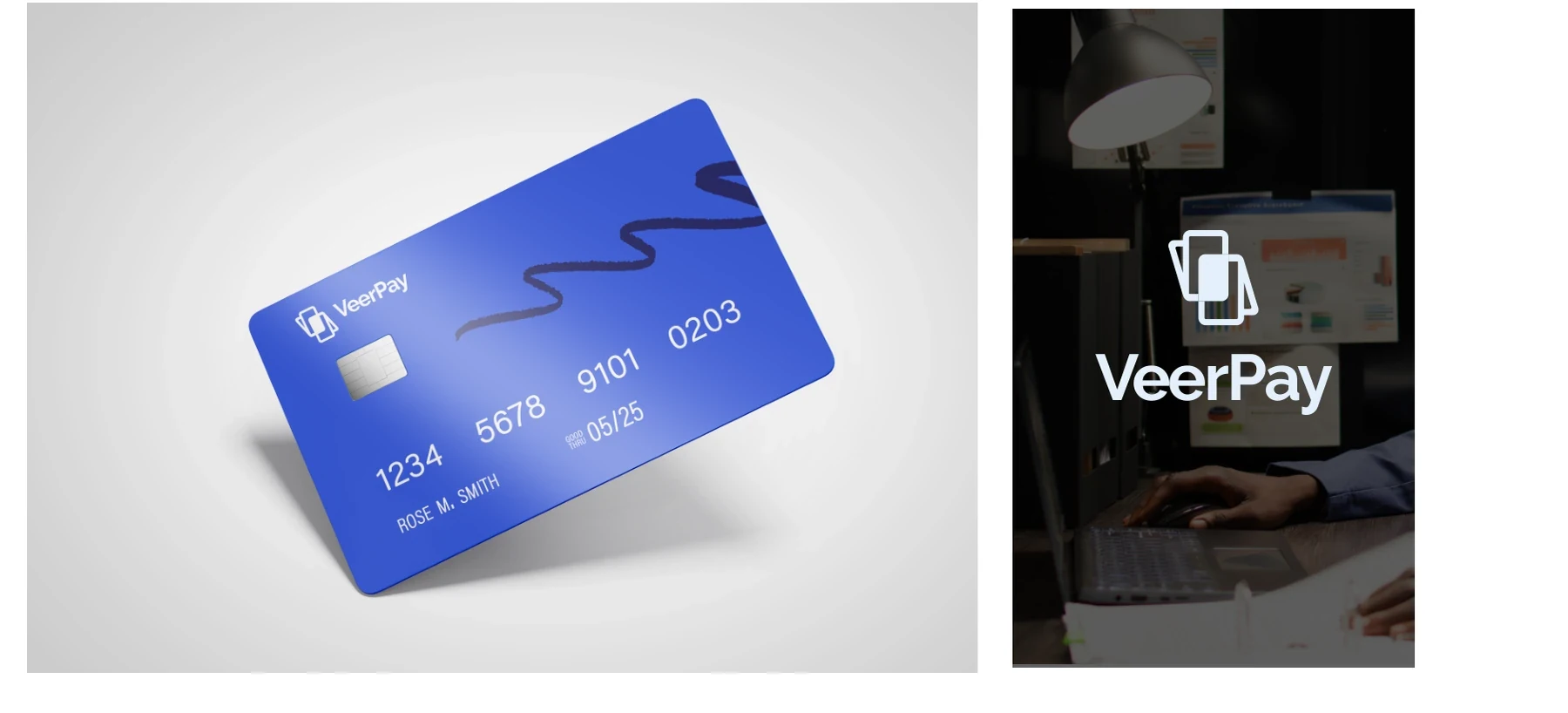
The card concept makes the payment connection tangible, while the digital treatments show how the same mark can adapt to light, dark and blue backgrounds. These are identity application concepts, demonstrating the brand system rather than asserting a particular product rollout or security implementation.
The completed identity
A wallet-inspired identity with responsive signatures, defined typography and a visual language designed to stay recognisable across digital and physical applications.
Project scope
- Wallet-inspired V-and-P symbol
- Horizontal, vertical and responsive signatures
- Clear-space rules
- Colour and typography specifications
- Repeat pattern
- Digital and payment-card application concepts
 Let’s create your next identity